Next Wednesday is a big day in the card year. Not only is Panini putting out their last product of the year, but they are releasing the first of the super high end breaks that I thrive on. This year, for the first time in a VERY long time, National Treasures looks to be on the up and up. They have on card non-rookie autographs for the first time since 2007, and the white dominated design looks good almost all around. Previous years’ designs have been a complete disaster
, while this year’s looks good from the previews.
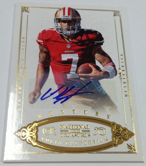
They have been previewing cards in the last few weeks leading up to the release of the set, and today’s preview showed a recession back to a feature that I cannot understand. For so many of their products, they seem incapable of designing around the sticker autos they depend on for every set during the year
. Where other companies like Topps and Upper Deck have found ways to use stickers without being too much of a detriment to design
, Panini consistenly fails. Actually, they dont just fail, they fall about as flat on their face as possible
.
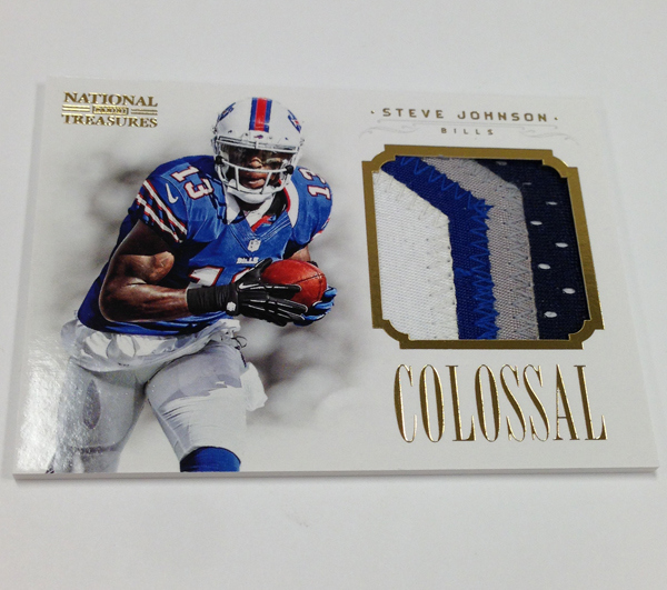
For 2012, the Colossal patch cards for the veterans in the set look REALLY good. They are very similar looking to a lot of what Upper Deck was able to do over the last two years of their license in the NFL. Its almost like Panini is finally starting to make Treasures more than just a 500 dollar box of Prestige with better patches. Then we see how the Colossal autographs are done, and everything goes to shit. Rather than finding a way place the sticker below the swatch, thus leaving the player photo to stand alone on the left, they put a big white box and slice the player off at the waist. In fact, they did such a poor job, that they actually sliced the smoke behind the player as well. I dont even think they were trying here, because the initial design is pretty stunning without the sticker.
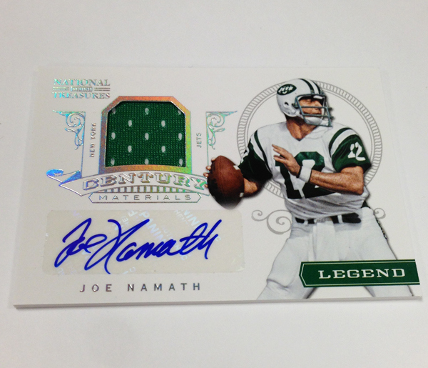
The big white box is all too common in Panini’s way of designing, and what makes this scary is that I rarely see anybody but a small handful of collectors speaking with their wallets. Topps is coming up on their 3rd year of Five Star with 100% on card autos, and we have yet to see Panini fully embrace this situation. Just to reinforce, these on card autographs from current veteran players are the first in AT LEAST 6 years! SIX YEARS! Not just for National Treasures, but for the ENTIRETY of their calendar. I am even having trouble finding any at all for the last 10 years.
That means for as old as some of your children are, Panini has not released a set of cards that included on card autographs from non-rookie and non-retired stars. Then, when they finally do get off their ass to do a product like this, its only one subset in a checklist of thousands.
It would be one thing if they could prove that they could design cards effectively without hard signed autographs, The big white box is all too common in Panini’s way of designing.
National Treasures will be released with the biggest price tag in football history. It is already selling about 100 bucks above MSRP because of how much people want the high end jumbo patch cards of the top rookies. With that big of an investment from each collector that buys a PACK of this product, let alone a case, they are unable to showcase that NT is deserving of that investment.
I REALLY like a lot of cards they have previewed. There are distinct indications that Panini has taken steps to improve this product. However, with consistent failures in design and content, I do not understand why collectors feel they should still support a product that performs in this way. Yet, every year comes forward, and the product is the top selling licensed set of the year, all while the far superior set in Five Star, is left to the collectors who actually know what a good set looks like.


The basic reason is most people are dopes and only care about the OMG sick jersey patch wowzzer 1 of 1!!**#(#@*(! even though they are going to be manu fakes on all the rookies…..
People dont spend any time thinking about these things and how much effort even companies like sage and press pass put into getting on card content…
At least with the big white box people wont be able to pull off a sticker and put it on a card that wasnt originally auto’d
Panini has no incentive to do anything different.. People will always buy NT and Contenders regardless of what they look like… Until they get into a situation like Upper Deck is in and the leagues continue to give exclusives to one company they wont change. Think of all the $$ they make as a default on basketball that allows them to keep going without really getting notice as to what their products do on the secondary market….
I hate paninis junk , but these look decent in my opinion, except for the kappernick…. But for the high end market, stickers should be a no-no
As long as clowns keep buying Panini products such as NT and Playbook, Panini will continue to be lazy with their quality control process and produce products with half-cut players, sticker autos, event worn jerseys, and jerseys from a touch football game (aka Pro Bowl). I am waiting for the day when there is a Panini card of a player missing his head which could happen any day now!
Since I complain about Panini’s subpar products, I do actually refuse to buy Panini products unlike others who do complain about Panini products but still buy their products. What Topps does has no effect on Panini. The only way for Panini to set up their act if the collectors STOP spending $$ on their boxes.
I haven’t seen a perfect product yet. They all have room for improvement. And, I tend to agree with most of your review. That said, this is the BEST looking National Treasures Football ever. In the world of business, what matters most is how the consumer chooses to spend his money. The topic that generated the most heated discussions at The Las Vegas Sports Card Industry Summit was our allotments of 2012 National Treasures Football. Everyone wanted much more than we were allotted. Internet prices are currently at about $595 per box and the product won’t hit the street until the 10th of April.
One of the reasons that National Treasures has historically done well is content. Box busters feel like they get their money’s worth. I won’t be surprised if 2012 National Treasures Football hits $700 per box within two weeks after release. The consumer speaks with his wallet and the retailer & manufacturer listen.
I agree this is the best it has been. However, as I tol you this weekend, this is the time to break out the big guns. If only they had REALLY taken the time to do it right. That would have been something to revel at.
2006 NT is still the best because they didn’t know the future success of the brand they were creating and they put EVERYTHING into it. The odd stuff (buttons, presidential cuts, leather helmets, facemasks) and jumbo HOF jersey patches and tags still haven’t been matched in any other year IMO. Even the brown color theme made it seem like an old-timey “treasure”. The new white polished stuff just doesn’t do it for me.
The design looks good, but sticker autos for a product as expensive as NT is totally unacceptable. Another Panini fuck-up.
In a similar vein, I had high hopes for Panini Select Basketball. The previews said the rookie autos were supposed to be “hard signed” and the images show on-card autos.
But as usual with Panini, reality shows most of the autos to be stickers. Can that company do anything right?