I loved Topps Chrome when it was THE rookie card to own. Products that cost 1500 a box werent generating the type of value in their chase hits that we got from Superfractors, and its clear that everyone in the hobby was jealous of the technology as a method for producing cards. In fact, Panini was so enthralled by Topps’ dominance, that they created a rip off equivalent of each of the Chrome sets that Topps put out.
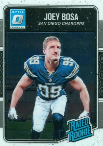
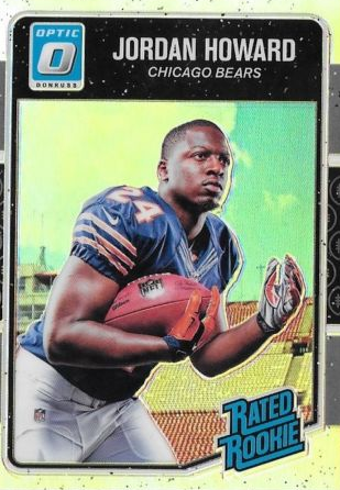
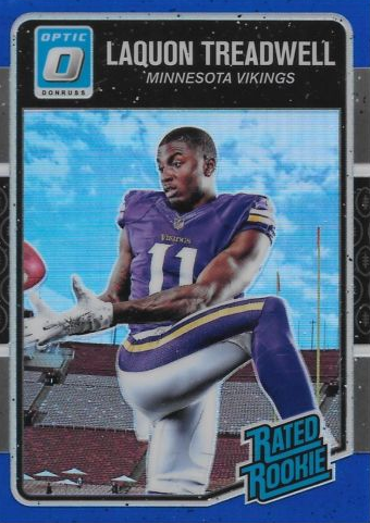
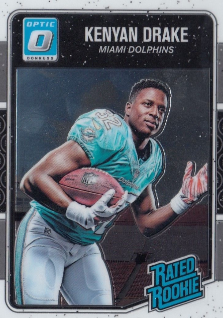
Optic is new this year, and the set had the right idea going in, creating a Chromed out version of the Donruss set that I liked a lot this year – save one specific aspect. The photos used on the rated rookie cards were tagged as the base for the product, and on card autos were used as the way to deliver the one auto per box. This is where the biggest fuck up of the year was made, as the ridiculous photos used in the Donruss set were not changed to reflect action shots or game shots.
As if I havent made myself abundantly clear this year, the use of these goofy ass photos just make me angry. It makes me angry because these could have been cool if action shots were used appropriately. Instead we are left with pictures of rookies flexing muscles or being handed footballs or awkwardly looking at the camera. Just writing this post has me as fired up as seeing Panini murder Spectra for the 3rd year in a row.
People often criticize my blog for hating on Panini with every fiber of my being. This is why I hate what they do. They dont make decisions that create good looking trading cards, and save a few surprisingly good sets, 2016 was as ugly of a clusterfuck as has existed since they took over Donruss just before 2009. I cannot stand the choices they make about so many different things, and seeing the disappointment over a potentially great on card chrome set just really drives that dagger home.
Panini will say they were trying to recreate the retro cards of the golden days of the NFL. I call bullshit. Im not even sure they understand why goofy posed photos were used back in those days. It wasnt because the card companies thought those types of photos looked good. Limited access to the players during the season, lack of a Rookie Premiere (the event created for card companies to avoid posed shots), cost of buying game shots, and lack of ability to show team logos were all a big reason why the companies had to go the direction they did.
Now that the Rookie Premiere exists for rookies to get action type photos before the preseason, the need to use this type of photography is no longer necessary. PERIOD. It doesnt create connection with the player, it doesnt highlight what football is all about, and it misses out on the dynamic pictures that have made the gridiron what it is today. Panini should be fucking ostracized for the use of these dumb pictures, and I cannot wait for a year to come where 2013 repeats itself. Dak and Zeke have made it easy for Panini to mail it in on card design, and collectors are more concerned with jumping on the Cowboy bandwagon, than examining the embarrassing display that Panini has put on this year.
Optic is not the ugliest set of the year, Panini owned the ugly side of things big time with Unparalled, Gala, Spectra, Phoenix and Infinty. Its the most disappointing because of the asinine decision on the way the Rated Rookies were done. I swear to god I will fight this fight as long as I have to. Enough of these fucking photos. I dont need to see Carson Wentz doing his best impression of Captain Morgan. I dont need to see Dak Prescott posing like he is checking himself out nude in the mirror. I want action. I want dynamic. I want REAL FUCKING GAME PHOTOS. Fuck Panini and their embarassing boner for showcasing rookies like fashion models. This is why they suck. This is why Optic is as disappointing as anything. It could have been so, so, so much more.


The problem with Optic/Donruss the veterans have small photo action shots while the rookies have the poised shot. I think if they used one designed for both sets of players it would have worked better. If the veterans were posed using the rated rookie design this would have been a better set.
I’m totally with you on this, while the Donruss card design is generally good looking, those photos are absolutely ruining it for me.
I mean men posing for a photograph on a football card, seriously? That’s super weird in my opinion and that’s totally not the way THAT’ RC should look like!
Beside the point that action photos look much better, it’s important for me that the players are wearing the Football Helmet as it represents everything for a football card!
Nevertheless, once again it looks that doesn’t matter to many other people in the hobby. Prices have gone up for Optic Boxes/Cases significantly and I’m not sure if hits are really that great or if Dak/Zeke are just yet doing their magic again.
I’m also a bit speechless that the overall look of a card doesn’t really seem to matter anymore …