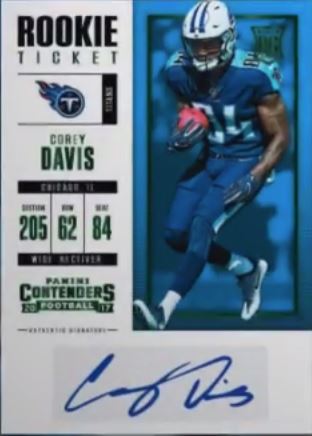
This is a big deal now that Panini has football all to themselves, and I cant even begin to explain how sad that is. Contenders has always been a collector favorite, and despite my arguments that it really doesnt deserve the rep it gets, here we are. Think about it for a second, there are really only a few good years of Contenders outside of the last two, and it just so happens those years have HOF players that happened to be included. Outside of that, the designs are fucking horrendous, with 2009 and 2011 Contenders being among the worst designs in the modern era.
Recently, it hasnt been all that bad, but the dilution of the Contenders brand hasnt helped. College themed products are an unmitigated train wreck, and rarely hold any significant value when real NFL stuff hits. This college invasion has cheapened and confused in some cases, and taken away from success in a lot of ways. Similarly, sets like 2015 and 2016 were actually pretty good looking, but its so easy to point back to 2014 and 2008 to show that this whole discussion has so much evidence pointing to how poorly the quality / consistency was managed.
Here are some good looking Contenders tickets from last year and 2015:
2016 Contenders Dak Prescott Auto Ticket RC
2015 Contenders Jameis Winston Auto Ticket RC BGS 9.5
Then gaze upon the rotting carcass of 2014, 2011, and 2009:
2014 Contenders Derek Carr Auto Ticket BGS 9.5
2011 Contenders Andy Dalton Auto Ticket RC
2009 Contenders Matthew Stafford Auto Ticket RC
With the release of the preview for 2017 Playoff, we get our first look at the Contenders design for 2017, and im not really jumping up and down after seeing it. Its not as bad as previous years, but it isnt all that fucking great either. Its like the equivalent of another middle of the year set that Panini blurs together over the middle part of the hobby year, and that is a god damned shame. There are few sets left that have a history, mainly because Panini has been so horrible at delivering consistently well executed products. Contenders is a set that will drive high value, despite my objections. If it looks great, im fully on board. If it looks like someone hopped on their squatty potty and shit out a turd, then its a really bad situation with no competition to go to.
This year’s card has so much wasted space, im disgusted that there was no one at Panini that had pause enough to say it wasnt worth making improvements. The player is trapped in the upper right, and the white dominated sidebar does not accomplish beauty like the negative space can do in some designs out there.
That being said, I really, REALLY like that Panini is doing preview tickets again for the second year in a row. It adds allure to ripping boxes of a product that doesnt have a lot of reason to rip, and that’s always good. If only we could ditch the NCAA license usage on Contenders, things would be much better all around.
Until then, we are stuck with what we have, and that is never going to get me excited.

