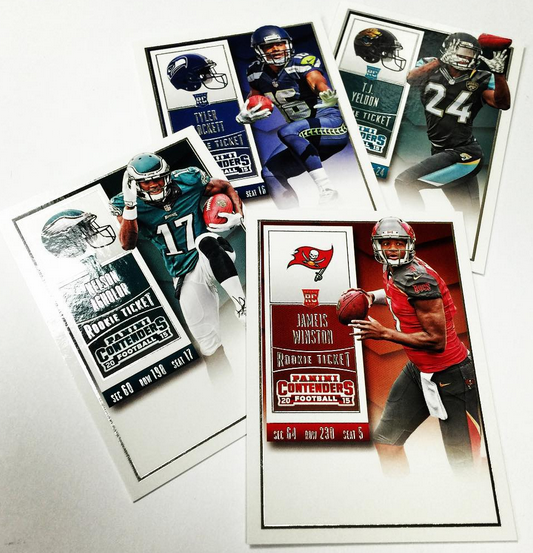
I have said on numerous occasions that Contenders is probably the set that Panini is most associated with. Its easily one of the most rabid loyal fan bases that Panini has been able to maintain, and its history is responsible for some of the most iconic cards of the modern era. That being said, outside of those iconic cards, the brand has been poor to mediocre at best in the way it looks, and I fail to see why people love it as much as they do.
Here are the worst of the worst designs:
2011 Contenders Cam Newton Auto Ticket
2009 Contenders Matthew Stafford Auto Ticket
2008 Contenders Joe Flacco Auto Ticket RC
2014 Contenders Teddy Bridgewater Posed Photo Variation Cracked Ice
When I saw the post for the new Contenders ticket for 2015, I tempered my expectations to very low. In my opinion, the last time Panini created a good looking ticket design on their own was in 2013, and before that, you have to go back to 2010. It has been a long road of shitty looks for the product, including the worst ever in 2011, and a horrible take in 2014. Contenders is rarely good looking, and that scared me for 2015.
Luckily, the design is actually great. They look to have gone back to a normal style ticket design, which almost looks similar to 2013 in a way. The vertical card fits in nicely with previous successful years of the product, and this time there isnt an autograph the players will have to sign going up the side. Its pretty simple looking, and SIMPLE IS FUCKING GREAT.
We have yet to see the rest of the set, for which Panini could resume being their normal selves, bringing the standard ugliness for the remaining unseen cards. At least as a whole, the Ticket should do a great job anchoring the product, leading to my happiness once again with a product I have had major problems with. Kudos to them.


Giving credit where credit is due. Give this designer a bonus, Panini.
Holy shit! They figured out how to use basic photoshop AND fade an image! Welcome to 2002, Panini!
The problem might come when that space at the bottom is used for a sticker rather than an on-card auto.
The black outline and plain white border is a little too “greeting card” for me. Why not let everything run to the edge?