When we first got a look at the Contenders design for 2015 a week or two ago, I was pleasantly surprised at how good it looked. It resembled a ticket (unlike last year's garbage), it was simple (unlike most other years
), and should be hard signed (unlike most of Panini's calendar this year
). That only left the rest of the preview, which I knew had some potential for being typical Panini. We were not disappointed.
Funny enough, this is actually the second Contenders product released this year, which as I said prior was a HORRIBLE idea. The previous version was a stickered college product that rehashed a terrible 2014 design, and once you see what is going down in 2015 Contenders, it will only bring about more questions.
Here is what I mean:
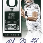
2015 Contenders Draft Picks Marcus Mariota Bowl Ticket Auto /99
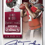
2015 Contenders Draft Picks Jameis Winston Cracked Ice Auto /23
2015 Contenders Draft Picks Andrew Luck Old School Colors Auto
2015 Contenders Draft Picks Tom Brady Alumni Ink Auto
I have mentioned many, many times before that Panini has horribly overpaid for pretty much every single exclusive license they own. Nothing more glaring than their recent exclusive with the NFLPA, but a close second is their college exclusive. This license is one that most people in the industry seem to think is a way to burn a ton of extra cash with no discernible advantage to the bottom line. There are even claims that the license was not profitable the whole time UD had it. Panini, knowing this is the case, has tried to inject college content into products that are pro-branded. 2015 Contenders will be no different, despite the fact that they already blew their college wad earlier this year on a dud set with trashy stickers and an old design.
I will say that the on card autographs and decidedly better look to this version is much more of a great thing, but it doesnt say much about the previous releases. Even more than that, someone on a forum made a good point of blending products like this without considering the audience. Im not sure that you gain anything by adding college content to a product that already has a loyal fan base as it is. If anything it dilutes the concept of the set, much like it used to do when college cards were inserted prior to 2010.
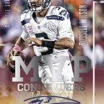
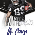
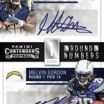
As for the rest of the preview, its stocked full of designs with laughably huge text, more stickers, and the typical stuff Contenders usually contains. In the long run, these things will matter not, as they rarely get any attention outside of the people who must have every card.
In considering the product as a whole, the design is great for the main hits, which means that the product should do pretty well. The wild card is always the rookie class, which has already been on a yo-yo through the first two weeks. I guess we will have to wait and see.


Pingback: Around the Carding Blogosphere for September 25, 2015 : The Baseball Card Store