I dont get it. I really dont.
When Panini came out with Playbook Football in 2011, it didnt sell very well. When they brought it back in 2012, it sold a little better, only because of Luck, Wilson and Griffin. Even then they are still very cheap examples of their rookie autographs
. In 2013, they couldnt give it away. In 2014, they changed the format and it arguably did worse than 2013 – despite the horrible 2013 draft class. For some reason it is back in 2015, and this time it looks worse than ever.
I will say that I like the Playbook box hit cards from 2011-13, despite the horrifically bad box price. I own some of these singles and they are really nice in person:
2012 Playbook Andrew Luck Auto Rookie Patch Booklet
2013 Playbook Adrian Peterson Auto Patch Booklet /5
2013 Playbook Cam Newton Auto Patch Booklet /10
2014 Playbook Calvin Johnson Nicknames Booklet Jumbo Patch
I think the silhouetted style player picture approach with the acetate looked really good, up until going to a black border and headshot in 2014. At that point, things went awry. Of course, outside of a few SPECIFIC cards, the entire set was fucking diarrhea. Turd worthy designs that showcase everything that is wrong with the hobby
. Just looking back through some of the sets, I am getting nauseous just from the horrid looking cards
.
There were two saving graces outside of the white bordered rookie and vet auto booklets – Down and Dirty and Game of Inches. Despite the porn friendly set names, these cards are crazy awesome. Die cuts, dirty patches, and really nice uses of the booklet technology.
Check them out from previous years:
2014 Playbook Russell Wilson Game of Inches Patch Booklet
2014 Playbook Marshawn Lynch Down and Dirty Jumbo Patch Booklet
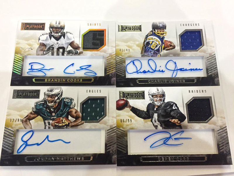
When it comes to other autographs and relics, the set ranges from terrible, to an absolute hot mess. Each year showcases some of the worst ideas Panini comes up with in their Dallas collector torture chamber, and 2015 is no different.
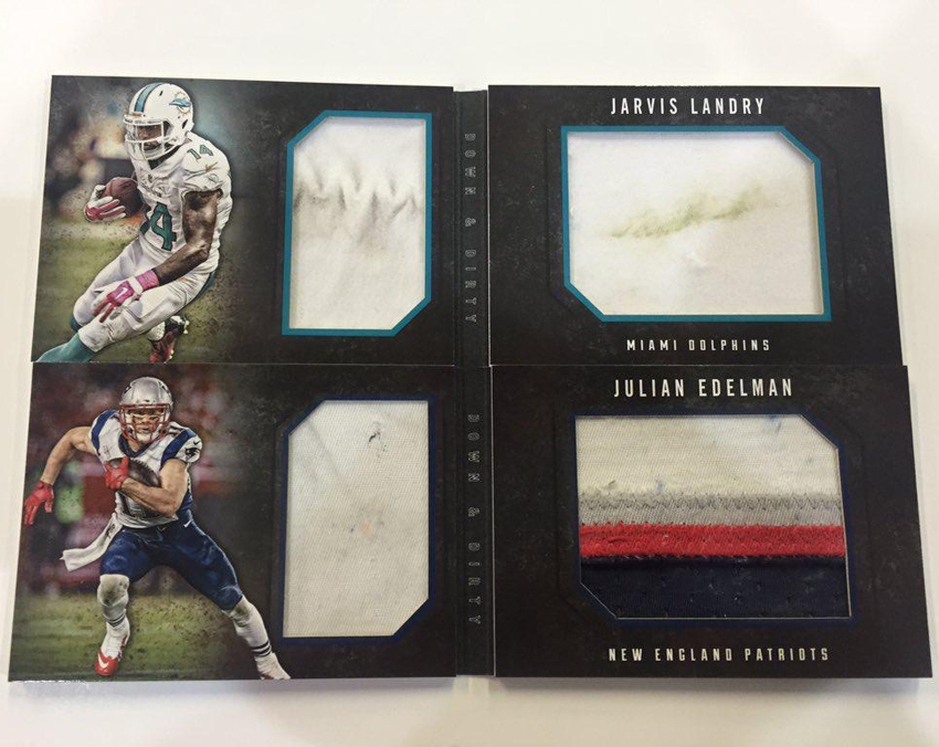
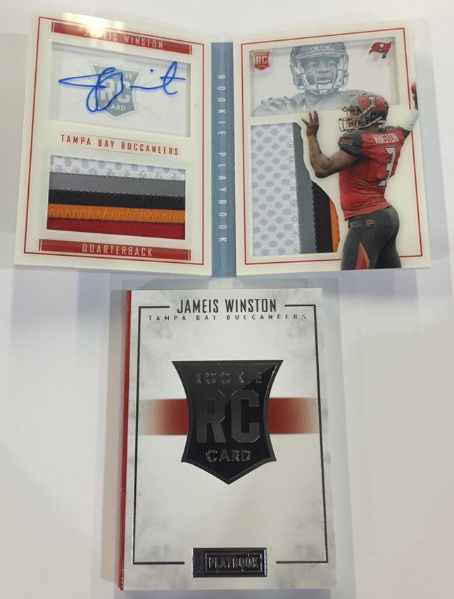
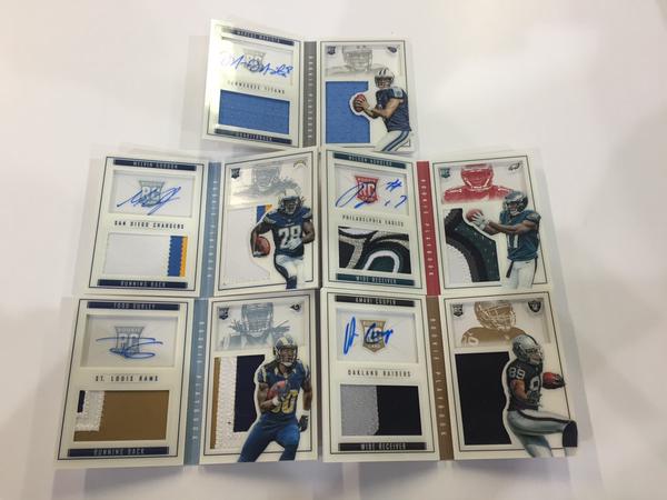
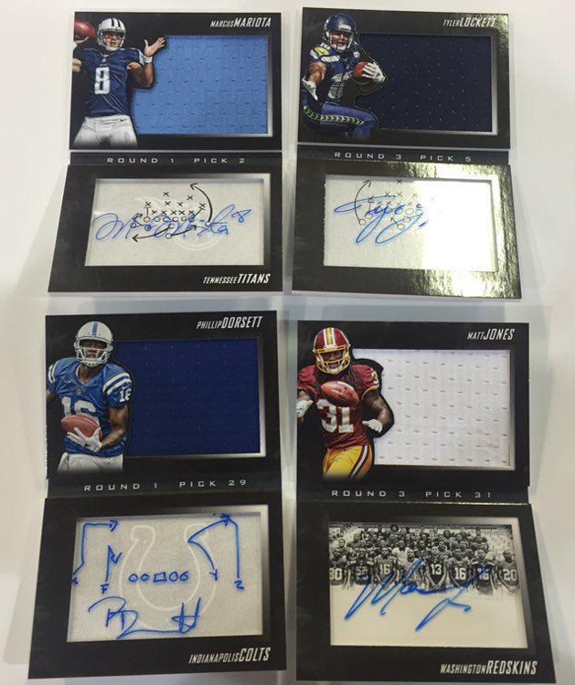
Looking at this year’s trash, the changes to the main booklet hits make no sense. Not only is there stark and infuriating asymmetry in the design, it is further highlighted by the fact that Panini decided to put them on a vertical axis instead of a horizontal one. The recessed window and the player picture inside it is beyond weird and perfunctory, as it serves literally no purpose in the design. These look uneven and unbalanced, and I dont get why they would screw up something that actually looked good way back when.
Additionally, the vertical booklets with horizontal pictures just dont work for me at all. They are literally giant relics with simple black borders that compose the cards. Panini has literally taken NFL jersey relics and made them the design of the card. Slap a border on them and off to the printer! This is amateur bush league bullshit, which uninformed collectors seem to love because OMG SIZCKS MOJOS PATCHEZZZZ!!!
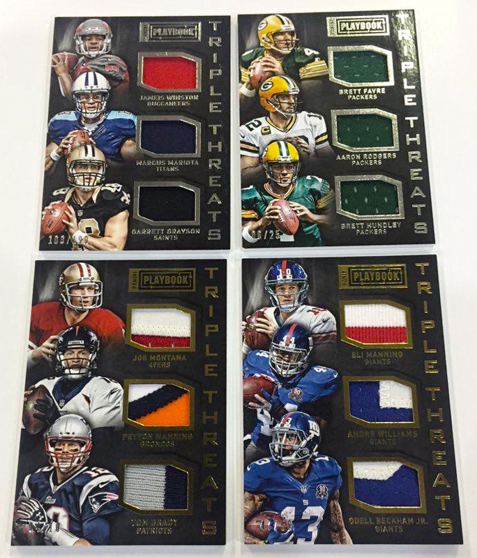
As a whole, Playbook is aimed at the part of the hobby who seem to care only about the content of a swatch instead of the design around it. This crap is made for group breakers with catch phrases, who need an animated gif to further accentuate their over exaggerated feelings. I hate it. I hate even more that people dont care about how little design is actually going to be a part of the card. They can waste their money all they want.
When you see a set like playbook, it becomes more obvious why Panini has been unable to create any lasting brands in their football shop. All their successful brands come from prior to the takeover, or are from Basketball. When you actually look at what the football team has built on your own, its hard not to laugh at how hard they have fallen on their face.
Im most scared to think what 2016 is going to be like, when Panini is forced to produce any number of new sets that have to be built to satisfy the enormous minimum guarantees that they have promised to their new bosom buddy in the NFLPA.
For now, we can only pray that Topps finds a way to stick around. Otherwise 2015 might be the last time I buy new football cards.


