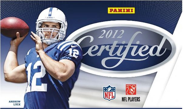
For over a decade now, Leaf Certified Materials (ne Panini Certified) has been a set that collectors have embraced. Even though it has produced some of the ugliest cards in modern football over the years, it has also given us some very good looking ones too. Last year, for the first time ever, the Freshman Fabrics cards were signed on card by the rookies. I thought this was a huge step in the right direction and was hoping to see more improvement this year. From the preview Panini posted on their blog, in some ways, the set got better. In the most important ways it did not.
Ill start with the most important part of the set, the Freshman Fabrics, which have a number of parallels that always tend to be the ones that bring the most value. Although I really like the overall design of the card, there is one thing that has bugged me about Panini cards for about 2 years now. They feel, for some reason or another, that they need to have a contrived source of light space for the autograph to show up. This space does not include designing the card to automatically do this for them, but instead having a big white box for the player to either sign on or behind the sticker. It would be one thing if this box wasn’t so defined and obvious as a detriment to the overall look, but its not. Its ridiculously prominent to the point that no one can avoid their eye being drawn there immediately. In some cases, the white box is placed on a lighter area to begin with, which makes me question why it is even done to begin with. This Luck card DID NOT NEED THE WHITE BOX, just make the background a different shade of what it is! They got it right with every other element on this card except for that, and as a result, my desire to purchase is gone.
The Tannehill is very similarly done in this preview, where the big white box is almost placed over the design like a label, with the autograph sticker placed on top. That is also quite confusing, as the card’s area did not need any lightened area to make the autograph prominent.
As for the Elway and Namath cards, both are done very well. In past years, the immortals autographs and jerseys have been some of the ugliest eyesores of the set, as the player is almost suffocated by the amount of crap they have to cram into a vertical card. This Namath is a complete digression from previous years, and I really like it. Now lets hope the white box doesn’t invade the autographed versions, as that could be just as awful as before. The Elway jumbo with the diecut window looks great, and shows what can be possible when you don’t cut corners by making every card have to have a bunch of parallels. If every jersey card is JUST meant to be a jersey card, then there doesn’t have to be incomplete looking cards when the sticker isn’t present. This Elway is a perfect example of how it can work.
Outside of that, the rest is pretty blah and then some. Panini has recently resorted to very boxy and compartmentalized designs, with each part of the card having its own little space on the card. Topps has been great at knowing when to break the design lines and how to break the design lines, and I am not sure why Panini hasnt figured that out yet. Its a basic part of visual art.
Certified, without the white boxes would have been a buy for me, but I wont touch it the way it looks right now. Its really too bad as I believe it could have been a winner.


Those look pretty sweet