Now that the products are off and running for 2013, we got two previews over the last two days that have encapsulated both the best and the worst of two companies that are usually on opposite sides of good and bad. Panini Certified has long been a collector favorite, but for me, I have rarely been able to say I liked any of the designs all that much over the tenure of the brand. Bowman Sterling has been much better than normal over 2011 and 2012, but a high price tag has always been an issue.
Panini Certified
As you are all well aware, Panini and I rarely ever see eye to eye on what a nicely designed card consists of. Last year’s Certified was a perfect example of this, with a poorly executed and poorly designed set that regressed heavily over the previous year’s example. Not only that, but after switching to on card autos in 2011
, Panini opted for stickers again in 2012. When coupled with poor design work
, collectors felt a bit like the effort was dwindling on a set that had been around for a decade.
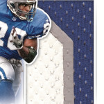
This year’s set looks incredible. With few exceptions, the cards in the preview look like this year’s Certified will be the best looking it has ever been. My favorite card in the preview is the re-imagined Freshmen Fabric, as the once boring and unimaginative subset has become dynamic and well conceived for the first time in its run.
Additionally, there will be commemorative sets for BOTH Emmitt Smith and Barry Sanders in the vein of the awesome John Elway cards from last year, which look about as good as a jersey card can look. The die cut player pictures are always a favorite of mine, and this is a perfect example.
My only complaint is the Triple Threads-esque Fabric of the game cards, which were the worst of the worst last year. Although they are a TAD better this year, its still obvious that Panini has no clear vision for the future of this all time favorite program. I wish they went back to the full bleed player pic and left the relic to be a compliment rather than a focus. I just dont like this.
Bowman Sterling
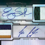
If there is one product in this hobby whose price point is about as far off as it could be, its Bowman Sterling. This is a product that should cost 100 bucks a box, but instead costs 250. This year’s set design is well below where it was last year, which I thought was the best it had been in the history of the product. This year’s design is borderline boring, with the look of “just another set” rather than the second most expensive product of the year.
Lastly, why is it that we are forced to endure sticker autos in a set like this? Inexcusable.
Topps personnel have already indicated that there will be changes to the product calendar, but here we are again with a vastly overpriced set that almost always fails to deliver. Bowman Sterling has always seemed like one more set to beat the Superfractor to death, and I dont think that will be any different this year. I do like the Lacy patch auto, but I fail to see what makes it different than any other card release. Its pretty much saying this is Topps Supreme with chrome stock.
Not a good showing from Topps here, at all.


Is it me or does 2013 Certified look a lot like the 2012 Topps design?
Always though Bowman Sterling should be called Finest Sterling. Same style and tech cards in each, 2 sticker autos for $110 in Finest and 5 sticker autos for $300 in Bow Sterling….
Pingback: Around the Carding Blogosphere for June 21, 2013 : The Baseball Card Store | Hairline Crease