Chromium stock should be a traded commodity on the exchange floor for the hobby, because it is obvious that collectors freaking love it. So much so, that the card companies are trying their best to find new ways to get it into more products. Up until this point in football, Panini only recently created their first set, as the snore inducing 2012 Prizm fell quite flat with me
.
Select has already seen a big release in Basketball, where Panini tends to launch products to ensure brand awareness. I thought it was one of the more ugly sets they put out:
2012 Panini Select Tyler Zeller Rookie Auto Patch Gold /10 – Hideous use of the big white box.
2012 Panini Select Kyrie Irving Rookie Auto Patch /99
2012 Panini Select Anthony Davis Auto RC
2012 Panini Select Klay Thompson Auto RC – See above
This year, we get another bore-fest in 2013 Prizm, as well as a more flushed out brand now in Select. I think of the two products, Select is a more original Panini style product, even though it has elements of Prizm and by extension Topps Chrome. However, it offers content different from what is available in Chrome, where Prizm is just a cheap knock off of the original Topps set. That’s not saying it isnt just another Panini set to fill their overstuffed calendar, but at least this one looks more flushed out.
As mentioned above, Select Basketball was already done earlier this year, and the quality starved collector base ate it up. Kind of a “drink the sand” situation when you are over-thirsty for well thought out and original releases. Now that we are getting the football version, I think its vastly improved over its ugly step sister
. The problem is that we are getting another Panini set without on card autos. When you have THIS many examples of stickers, people tend to get bored. Although the design isnt horrible, the effect of a good crossover seems muted without hard signed autographs.
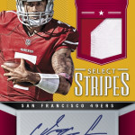
Of course, when you look at the ugly Colin Kaepernick card, Panini showcases why they continue to struggle designing new products. They love cutting people off at the waist, without much transition space, thus making the design visually unappealing. This seems to be the case for the entire product, with Panini obviously overreacting to having a defined space for an autograph. Sure, when you cant see the autograph, its just as bad a situation, but going to the complete other side of the spectrum doesnt work either.
Eventually, people are going to start wondering what makes each Topps and Panini product special, and throwing the money at ones that offer a unique experience. Not every product can be as fresh as Topps Strata, but it shouldnt be as stale as Prominence either. Select falls in the middle, as it does bring the basketball precedent with it, but Im not sure this is the right direction for a calendar laden with Rookies that arent performing exceptionally.
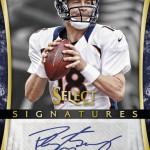
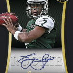
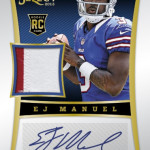
Here are the pictures:



So Panini has a $3 pack chrome lite and a $6 pack chrome lite?