There are few products out there that I hate more than Totally Certified. Aside from the utterly stupid name of the product itself, the combination of poor design, etched foil and price point, all make it hard to beat in terms of how low it falls on the scale. For whatever reason, Panini has decided it is worth bringing back for a third year in a row, despite no evidence of success in previous years
. This was a successful product in Basketball for a number of irrelevant reasons, but Panini fails to see that Basketball prominence should not be a reason to continue it in another sport.
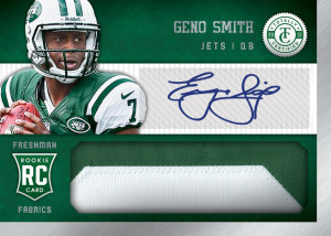
Rookie Auto Relics
Here is the thing – I think these cards were horribly awful in both 2012 and 2011. The oddly designed diecut was not at all visually appealing, and the design made for a triple threads style presentation with a focus on the relic. This year is better, but its still a lipstick on a pig situation. Not only do I think the foil stock used for this product is absolutely hideous, but I think the overall presentation of the card is both boring and focused on the wrong element. If they could use a full player picture instead of the bust, I might have somewhat different feedback.
Last Year:
2012 Totally Certified Nick Foles Auto RC Jersey
2012 Totally Certified Doug Martin Auto RC Jersey
This Year:
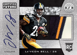
Certified Future Auto Relics
Man, this is the worst card in the preview, and that is saying a lot. It might even be worse than 2012, which is a feat in itself. Not only is there a giant box for the sticker (a Panini Trademark!), but the overall design is busy and unbalanced to the right. I have no clue why there is a big box for the sticker when the rest of the card has borders of different colors, but that’s Panini for you. It looks awful.
Last Year:
2012 Totally Certified Andrew Luck Certified Future Auto Patch
2012 Totally Certified Ryan Tannehill Certified Future Auto Patch
This Year:
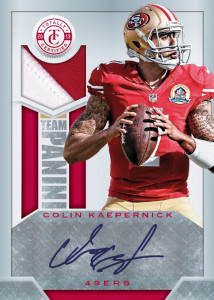
Team Panini Auto Relics
I don’t think this stuff would be all that bad except for the fact that the big giant silver box is back for another turn at the trough. I HATE HATE HATE when cards are designed this way. For fuck’s sake, the background is already white, the sticker will show up. Maybe this is a further case to NOT USE STICKERS unless you have to. What a visual disaster. Also, what the hell is “Team Panini?” Even more than that, why is it being commemorated? Im guessing its “congratulations for having leftover stickers in our warehouse! Welcome to the team!”
Last Year:
2012 Totally Certified Ryan Mathews Team Panini Auto Patch
2012 Totally Certified Andy Dalton Team Panini Auto Patch
This Year:
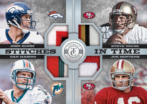
Stitches in Time Relics
This card doesn’t look all that bad for a quad relic, but the etched foil stock will kill all visual appeal. The checklist wont be multi colored patches of these four guys either, it will be mostly swatches that have zero to no value. Its cards like this that will kill the box’s price point, and shouldn’t be considered as the pack hit in a high end product.
Last Year:
2012 Totally Certified Stitches in Time 49ers Quad
This Year:
Again, this product is a complete joke and should TOTALLY be dropped from the Calendar. Its almost like Panini is out of ideas for new products, so they just recycle all the shit from the previous year and hope that tides change in their favor. Obviously that is completely the wrong approach as we have seen in the past, with so many of their products from 2012 still sitting on store shelves. If it cant sell last year with the best class in history, why try again?!?


