In the past, Absolute and I have had a very love/hate relationship, mainly due to the overall theme and concept of the set. To be honest, Panini has pretty much made Absolute its equivalent of Triple Threads, invariably changing nothing over the course of the product’s history, and creating a very stale set along the way
. Some of the football hobby’s ugliest cards have come out of Absolute
, and that doesn’t even begin to speak to a box configuration that should have changed five years ago.
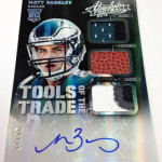
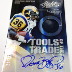
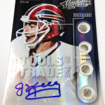
There is one part of the preview that we should be excited about, as the Tools of the Trade set looks incredible for the second year in a row. Take a look at the awesome examples from last year:
2012 Absolute Tools of the Trade LeSean McCoy Quad Relic Auto
2012 Absolute Tools of the Troy Polamalu Auto Logo 1/1
2012 Absolute Tools of the Devin Hester Auto Dual Relic
These Tools of the Trade cards are really well done in the concept, as its obvious that a lot of consideration was given to the wide variety of swatches that will be used across this subset. I like that they highlight where the swatch is coming from, and they look even better with the autographs attached. I will be chasing a few of these this year, but only on the veteran side. On the rookie side, these cards might as well be junk, as the concept was done significantly different. No idea why.
Bottom line, this set is stuffed to the brim with cards that would have invited excitement back in 2006, but because it hasn’t been adjusted since that time, the whole thing feels deflated. Last year was a prime example of how much junk was put into this set, with an enormous amount cards that arent worth the cardboard they are printed on
. We also see that they are going back to stickers for the first time in three years, showing even LESS commitment to a class that desperately needs all the help they can get.
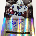
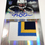
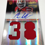
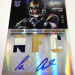
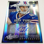
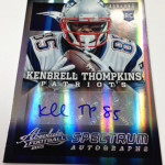
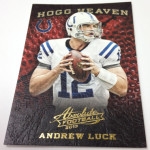
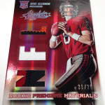
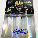
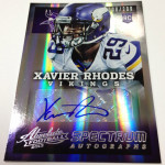
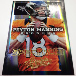
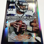
After looking at the preview that does have some really nice looking cards, the main cards everyone will pull look horrendous. The base cards with the nameplate across the chest look beyond weird. When adding in autographs and more text in the base autos, its as busy as it has ever been. Last year’s were some great looking cards, and its unfortunate they could not be replicated. The rookie premiere materials look as bad as they did in previous years
, confining the rookie’s picture to the top third of the card, instead of opting for a horizontal orientation. This makes no sense, as there is no reason to continue with the cards being vertical if nothing special is going to be done with the bottom two thirds of the design. Panini happened to choose stupid studio style pictures, for some god forsaken reason, which only adds to the creepiness of the stark black background behind them.
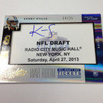
Im not even going to talk about these signed draft tickets, where it looks like Panini just printed off pieces of paper for the rookies to sign. Not only are they a dumb idea, but poorly designed.
As mentioned above, Ill definitely be chasing down some singles, but to buy a few boxes of this stuff could mean destruction for your wallet. We are already know that you can buy in at 45 bucks a pack and pull nothing more than a .25 cent jersey card, and with a class like this, its all but guaranteed you will be walking away shorthanded. Value hasn’t been a strong point for these cards in years, and it DEFINITELY will not be changing this year.

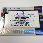
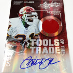
I have to agree with you. These draft ticket cards definitely lack eye appeal and look like they were printed off of Microsoft word or something. The tools of the trade cards have a great look to them. I wouldn’t buy a box or a case of these but I might try to get my hands on a few of those Tools cards.
Pingback: Teaser Gallery: Panini America Opens Some Early Boxes of 2013 Absolute Football - Blowout Cards Forums