Back in 2006, when I first got into football cards, Leaf Limited was one of the sets that drew me in. At the time, it was a higher end set that was priced more reasonably than any of the other sets of its kind, and I really enjoyed the cards that were in the set. In 2007, when Adrian Peterson was a rookie, it was the first high end card/box I purchased, all because I liked the way the cards looked.
Since that time, Limited has been on a relative downward slope, with design work being less of a focus for making the set relevant. Last year’s set had some highlights, no doubt:
2012 Limted Case Keenum Auto RC
2012 Limted Nick Foles Jumbo Number Patch Auto
2012 Limted Joe Flacco Jumbo Patch Auto
It also had some of the worst cards in recent memory:
2012 Limted Brock Osweiler Membership Auto
2012 Limted Doug Martin Hogg Heaven Football Auto
The long and short of it is simple – Limited is a brand in need of a complete overhaul. Much like many of Panini’s sets that still have extensive single jersey content
, the hobby has moved on. Not only has the hobby moved on, but its evident that products like this are more likely headed for the discount bin mere weeks after release.
Panini has put MAPP pricing back on the table, especially as it becomes more obvious that collectors are growing tired of little to no ROI on products that cost as much as Panini’s do. It really should come as no surprise that Panini has not had a single product that has cracked the top 10 in sales this year, instead getting owned by the competition. Although they have had some great looking cards
, most of their products have been as flat as ever. Collectors seem to agree, as they refuse to open Panini wax, and provide rampant negative feedback on forums. I don’t blame them when cards look so terrible
. Almost every single product is selling below dealer cost with maybe one or two exceptions, and that is not good for business.
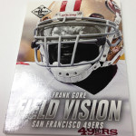
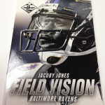
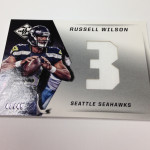
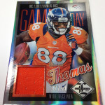
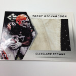
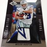
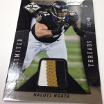
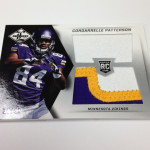
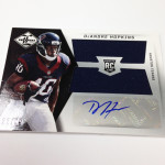
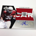
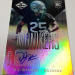
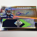
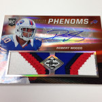
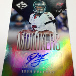
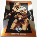
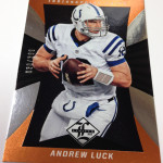
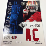
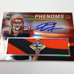
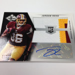
At the very least, these cards need to look better, with more effort put into developing design that is more focused on creating new perspective in player photography and dynamic action. I know, beauty is in the eye of the beholder, but I think its tough to see where these cards would be considered attractive by any stretch of the imagination. The colossal swatch autos are the best looking cards in the preview, as they were last year as well. but they don’t reach their full potential because of the way the swatch windows don’t match the pattern on the card. The burnt orange base cards are hideous, as are the jumbo patch auto rookie cards that are about as big a downgrade as ever over a previous year. The field vision cards are some sort of gimmick, it looks like, but I don’t understand why they are building a subset around visors. That just seems fucking boring. Its like celebrating the use of finger tape. Who gives a shit about visors? Then again, this is the same company that celebrated diamond studs that the players wear
.
People often criticize my views on Panini, but I want them to succeed. I want them to improve because it will inspire others to have to match wits with the competition. Right now, I doubt Topps even thinks Panini is the gum stuck to the bottom of their shoe. With almost every Topps product selling above MSRP, they are finding a way to make it work with a year that isn’t for the faint of heart.
We still have yet to see any information regarding National Treasures, but I can guarantee that it wont be pretty if the year continues to shape up the way it has over the last few products we are getting previews for. Last year’s Treasures was the best NT set ever, and that isn’t an opinion. However, its still clear that Panini has not taken collector feedback in what we want to be in their products. As a result, I am legitimately frightened to see what they believe are their areas of weakness that need work. Im not even sure they know, let alone care. That is about as bad as it can get.
Here are the pics:

