We got a big truckload of Panini previews today, some very good, some horrendously bad. Panini, for all intents and purposes has been piss poor all year. Despite that, I continue to be pretty intrigued by some of their upcoming releases, while others make me reach for a large bottle of asprin to cure the headache. Its clear which products will be design winners overall when you see the cards and set influences
, while others look about as bad as they ever have.
Immaculate Collection
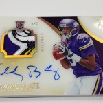
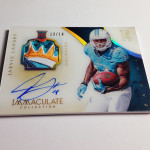
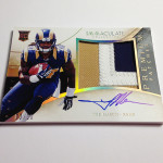
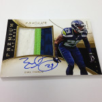
Despite my objections to the name, this set has made a name for itself in Basketball. It looks to be just as good in football, even better than Flawless ever could. Its clear that the person that built this product has an eye for what a luxury brand should look like, something I rarely see in other Panini products.
Check out these beautiful cards from other versions of Immaculate:
Panini Immaculate Kevin Durant Jumbo Patch Auto
Panini Immaculate Ken Griffey Jr Patch Auto
Panini Immaculate Mike Trout Auto Relic
Panini Immaculate Larry Bird Auto Patch
Each design looks simple and high end, which is EXACTLY the way it should be. Fluidity in the look of the card improves the visual appeal, instead of the usual nauseating separated box look that Panini ALWAYS chooses. Notice, even when the GIANT TEXT is used, it looks better than it has before. You NEVER get that with Panini. Its always a veritable dumpster fire
, but not with Immaculate so far. It all looks really, really good.
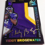
My favorite cards are definitely the patch autographs that feature an acetate style stock on the front of the card, as it adds pop to the presentation. The cards would have looked great regardless of the stock, but the acetate plays it up. This was well done in basketball too, and I am glad it is coming to football.
I also have to give Panini credit for a second product that is 100% hard signed, as that deserves praise. This one looks a million times better than Flawless did, which is concerning for the previous set, but great for this one.
Spectra
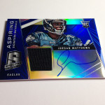
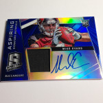
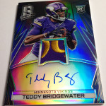
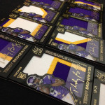
I dont get Panini’s mindset with Spectra, but that shouldnt be a surprise. They have the business sense of an Enron executive. Spectra was a dismal failure last year in Football, and yet, they want to bring it back? Wonderful. They modeled the product after Bowman Sterling, which is a train wreck in its own right
, thus telling you how bad the set idea was. The 2013 cards didnt look SO bad that I had to avert my eyes, but they werent good either. I still see 2013 Spectra rotting on shelves, despite hard signed veteran/HOF autographs
.
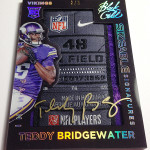
What does Panini do? Change the format to a one pack 250 dollar product, and use one of the worst looking designs they could possibly choose. Unlike Immaculate, where the product's signature areas and jersey swatches integrate perfectly with the look of the card, Spectra is the opposite. Big fucking boxes for every last element of the card, leaving the player to be squished into a tiny area at the top. I laughed when I saw these cards, and I mean that. Card designs should never illicit a reaction of laughter.
Black Gold
Lets be serious here, as its becoming more obvious with each passing set that Panini cannot build a brand without A) falling miserably on their face B) Ripping off another company or C) Both. Black Gold is a combination of Gold Standard and Black, which featured elements taken from other dead Upper Deck brands.
Here is UD Black for reference:
Upper Deck Black Michael Jordan / LeBron James Patch Auto
Upper Deck Black Peyton Manning Auto
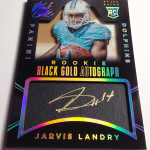
Like the sets it was taken from before, Black Gold is a hideous excuse for a set, save one type of card. That card, which is a well executed copy of the Strata Clear Cuts, looks awesome.
Strata is one of my favorite products, and the “Sizeable Signature” cards are a sweet looking rip off of the box hits from that set. I have always said that if you are going to face bite another company’s work, you better do it well. Prizm was always Diet Chrome
, done so fucking poorly that I couldnt take it. This is different.
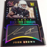
As for the rest of the cards, they are the typical design turds that Panini is famous for. My absolute favorite cards in the preview are these "cut autograph" cards that were used in Immaculate baseball. For the longest time I thought they were actual cuts, which is unacceptable in its own right
, but they are actually hard signed. Yes, Panini actually designed a card that looks like one of the ugliest cut autographs in history, only it is put in front of the player to sign after it is produced
. They could have at LEAST just made a gold box in the design for the players to put their autograph, but this is beyond hilarious. They think this shit looks good, and that is so scary to me.
So much of what Panini does in visual appeal of their sets is against my card design religion, that is why I hate so much of what they do. When looking at the cards they preview I have a wretch worthy reaction more times than I can count, but as we see, a broken clock is still right twice per day.
2016 looks more and more bleak with each passing day.


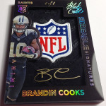
At least they chose a good design to rip off (Exquisite) for Immaculate.
I like the acetate look on Immaculate and Black Gold looks solid. I guess as long as there’s only room for one NFL license, then it’s a win for consumers when Panini copies UD and Topps product concepts and designs.
I hope Panini proves me wrong on these products, but I feel like they always preview the best cards from the set, featuring on-card autos, then fill out the rest of a box with sticker autos and jersey cards that don’t live up to the designs they previewed. I don’t want all their products to be a singles market. I’d love to be seduced into actually buying a box of Panini product.