A Winner and Two Losers: Panini Immaculate Football Leads New Previews

We got a big truckload of Panini previews today, some very good, some horrendously bad. Panini, for all intents and purposes has been piss poor all year. Despite that, I continue to be pretty intrigued by some of their upcoming releases, while others make me reach for a large bottle of asprin to cure the headache. Its clear which products will be design winners overall when you see the cards and set influences, while others look about as bad as they ever have.

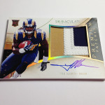
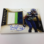
Immaculate Collection

Despite my objections to the name, this set has made a name for itself in Basketball. It looks to be just as good in football, even better than Flawless ever could. Its clear that the person that built this product has an eye for what a luxury brand should look like, something I rarely see in other Panini products.

Check out these beautiful cards from other versions of Immaculate:

Panini Immaculate Kevin Durant Jumbo Patch Auto

Panini Immaculate Ken Griffey Jr Patch Auto

Panini Immaculate Mike Trout Auto Relic

Panini Immaculate Larry Bird Auto Patch

Each design looks simple and high end, which is EXACTLY the way it should be. Fluidity in the look of the card improves the visual appeal, instead of the usual nauseating separated box look that Panini ALWAYS chooses. Notice, even when the GIANT TEXT is used, it looks better than it has before. You NEVER get that with Panini. Its always a veritable dumpster fire, but not with Immaculate so far. It all looks really, really good.

My favorite cards are definitely the patch autographs that feature an acetate style stock on the front of the card, as it adds pop to the presentation. The cards would have looked great regardless of the stock, but the acetate plays it up. This was well done in basketball too, and I am glad it is coming to football.

I also have to give Panini credit for a second product that is 100% hard signed, as that deserves praise. This one looks a million times better than Flawless did, which is concerning for the previous set, but great for this one.
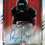
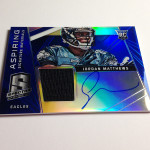
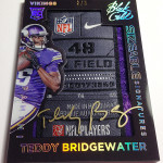
Spectra

I dont get Panini’s mindset with Spectra, but that shouldnt be a surprise. They have the business sense of an Enron executive. Spectra was a dismal failure last year in Football, and yet, they want to bring it back? Wonderful. They modeled the product after Bowman Sterling, which is a train wreck in its own right, thus telling you how bad the set idea was. The 2013 cards didnt look SO bad that I had to avert my eyes, but they werent good either. I still see 2013 Spectra rotting on shelves, despite hard signed veteran/HOF autographs.

What does Panini do? Change the format to a one pack 250 dollar product, and use one of the worst looking designs they could possibly choose. Unlike Immaculate, where the product's signature areas and jersey swatches integrate perfectly with the look of the card, Spectra is the opposite. Big fucking boxes for every last element of the card, leaving the player to be squished into a tiny area at the top. I laughed when I saw these cards, and I mean that. Card designs should never illicit a reaction of laughter.
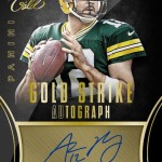
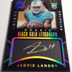
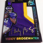
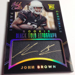
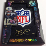
Black Gold

Lets be serious here, as its becoming more obvious with each passing set that Panini cannot build a brand without A) falling miserably on their face B) Ripping off another company or C) Both. Black Gold is a combination of Gold Standard and Black, which featured elements taken from other dead Upper Deck brands.

Here is UD Black for reference:

Upper Deck Black Michael Jordan / LeBron James Patch Auto

Upper Deck Black Peyton Manning Auto

Like the sets it was taken from before, Black Gold is a hideous excuse for a set, save one type of card. That card, which is a well executed copy of the Strata Clear Cuts, looks awesome.

Strata is one of my favorite products, and the “Sizeable Signature” cards are a sweet looking rip off of the box hits from that set. I have always said that if you are going to face bite another company’s work, you better do it well. Prizm was always Diet Chrome, done so fucking poorly that I couldnt take it. This is different.

As for the rest of the cards, they are the typical design turds that Panini is famous for. My absolute favorite cards in the preview are these "cut autograph" cards that were used in Immaculate baseball. For the longest time I thought they were actual cuts, which is unacceptable in its own right, but they are actually hard signed. Yes, Panini actually designed a card that looks like one of the ugliest cut autographs in history, only it is put in front of the player to sign after it is produced. They could have at LEAST just made a gold box in the design for the players to put their autograph, but this is beyond hilarious. They think this shit looks good, and that is so scary to me.

So much of what Panini does in visual appeal of their sets is against my card design religion, that is why I hate so much of what they do. When looking at the cards they preview I have a wretch worthy reaction more times than I can count, but as we see, a broken clock is still right twice per day.

2016 looks more and more bleak with each passing day.

On The Radar: 2015 Bowman Football

From what distributors have been saying, it looks like 2014 Bowman was actually one of the more successful products of the year, releasing some of the first autographs of the new class. Because everyone goes NFL Draft crazy, card companies salivate at trying to capitalize on the early buying cycle. For a class that has huge draft potential, and no on field production to screw up prospecting, this is prime time.

Here are previous editions of the product and what they looked like:

2014 Bowman Chrome Odell Beckham Gold Refractor Auto /50

2014 Bowman Chrome Teddy Bridgewater Red Refractor Auto BGS 10

2013 Bowman Chrome Eddie Lacy Xfractor Auto BGS 9.5

2013 Bowman Chrome Le'Veon Bell Auto Refractor BGS 9.5

Last year’s Bowman product was great as long as you dont care about rookies in retouched college pictures. Its very similar to a Leaf style product, in that respect (here are those cards for reference). The difference is the brand loyalty and availability, as well as the fact that the Chrome name carries certain value elements along with it.

This year’s design looks better than 2014 in my opinion, going for a more boxy type look and less curvy space type. Although I was a fan of the design of and ripped a ton of 2014 Bowman, this looks better to me. I like the boxier type of design.

In previous years of Bowman, there was a focus on a lot of color autographs, sometimes multiple per box, and a ton of base with lots of parallels. In jumbo packs, this is the recipe for success, and adds perception of value in a lot of ways. Although auto checklist will all depend on the deep parts of the class, its a crazy fun rip.

There is one thing to consider, and it is a VERY big thing. Panini has acquired the CLC license, which means that all their pre-draft products can potentially have college uniforms involved. Im still reaching out to see if you can include NFL logos or NFL cards in a product that also feature CLC, but I have yet to hear back.

If Panini decides to use College Uniforms in their initial offerings, it will have an effect on the success of a product like this. Although prior to 2010, this was the norm, nostalgia makes the heart grow fonder.

Bowman struggles to wrangle in the people who wont buy the retouched photos, despite having great looking cards with hard signed autographs on chrome technology. Dont get me wrong, it has been successful both years they have done it, and I think we have every reason to believe that it will continue. However the manifest destiny plan of Panini will lower tides for all boats without their logo on the side. Beware.

Here are the 2015 cards:

Diving Deeper into 2014 Contenders Football

Everyone who has been reading the site over the last few days has seen how much I have dissected the botched set that Panini is labeling as Contenders. Its really no better than many of the other trash they put out, just with a logo that makes people drop money they shouldnt drop. Slap another logo on this product and it heads straight to the bargain bin to join it’s brothers and sisters. Contenders has a legacy, an undeserved one at that, but its still a legacy.

The Good

As I have mentioned before, the Rookie Ink set looks really good. It should have been the ticket design, and that’s no freaking joke. Not only does it have a ticket style presentation, but its a good ticket style presentation. Im pretty sure someone at Panini fucked up with the same reckless abandon that they usually show, so it doesnt surprise me that this dumb ass move was made.

Here is what I mean:

2014 Contenders Mike Evans Rookie Ink Auto

2014 Contenders Sammy Watkins Rookie Ink Auto

2014 Contenders Johnny Manziel Auto Rookie Ink

I also like the Rookie of the Year Contenders set, as the design is functionally laid out in a much more visual appealing fashion. The issue I have outside of design is what happens when you get an autograph in this set that is not Odell Beckham? When Beckham wins the ROY, does it devalue the rest of the cards in this set? I dont know, but at least they look good.

Here is what they look like:

2014 Contenders Teddy Bridgewater Rookie of the Year Auto

2014 Contenders Jimmy Garroppolo Rookie of the Year Auto

Although the player himself is a joke, its cool to see more buy backs in Contenders. This needs to happen with more frequency and with better players who didnt get the real ticket treatment. Hell, even if they did, its still worth having more on card autos from non-rookies. The Sherman RC auto from last year still remains a top card to chase.

It should be noted that the NFL Ink set looks cool, but I am wholly against calling a sticker set "INK" in any way shape or form.

The Bad

Im sure you are wondering why I would be putting the ticket design in this part of the post, instead of the last part – considering my reaction. There are so many other horrible parts of this set that I had no choice. Basically, the ticket design is a crime scene of design flaws, including a general lack of attention to what made Contenders’ top card what it is. For a card that is called a ticket, it has no discernible elements of a ticket look, and that’s just the start.

First off, we get the typical bullshit that Panini is infamous for using in a nauseating fashion. GIANT TEXT? Check. Huge logo? Check. Separated area for a signature? Check. Its all there. Even worse, now that one of my readers mentioned that the logo and text is not centered on the card, I cant unsee it. Its just a noticeable tad to the left. The anal card collector in me cringes a little more each time I see it.

The Ugly

The variations in this set are so bad that im pretty sure they are being added to the ballot in 32 states to be criminalized for possession. Not only are there now so many that its impossible to keep them straight, but each variation has its own parallel structure. As far as I can tell, that would mean that each has its own cracked ice and 1/1s? I have no idea. The fact that we have to think like that makes it even more stupid.

Funny as all the parallels might be, it means that Panini cranked the shit out of the production run this year, and that doesnt even factor in retail. The only good thing is that many of the top rookies have a lot of autos, although value will be hurt by that more than helped.

Panini also found it worthwhile to add studio shots to one of the variations, and I cannot even put into words how retarded that decision is. Wait, let me try.

“Panini has their heads so far up their own asses, that they fail to realize how much of a dumpster fire each card with a studio shot becomes. I would rather watch offensive lineman play quarterback in the Super Bowl than collect these horrid excuses for trading cards. We are all dumber for having to endure this stupidity, they are awarded no points, and may god have mercy on their souls.”

Nope, still not enough.

Adding to the pain of getting cards like described above in your box break, is getting rewards points in 7-8 boxes of every case. It allows them to say, “HOLY SHIT YOU GET 6 AUTOS PER BOX! MOJOZ!”, when in reality its the equivalent of giving a collector something worse than a redemption. Currently collectors still have to pay for their cards to be shipped to them, and for 150 points you can buy nothing of worth. Even if you save all your cards, and accumulate a ton of points, enjoy your Michael Floyd score auto.

Points cards cost nothing to produce and allows them to market their product as having added value and content. It is nothing of the sort. Even if you were to pull a scrub auto instead, there are set builders who might need that card. Instead you are left with a reach-around handy that basically serves as a reminder you didnt get what you thought you were getting.

Bottom line, this year’s Contenders is not the worst its ever been, but it might as well be. With such a deep class, this is the kind of shit that this set is known for. Instead we are left holding our dicks and praying that someone at the NFL will realize they made a huge mistake in giving them the exclusive, and determine the money isnt worth it. Its getting to the point where I would rather no one produce football cards than Panini.

2014 NFL Playoffs: Underrated Players Continue to Shine

Here is the thing about the playoffs. Everyone automatically receives a ton of value just for playing well. So, with that, there are a lot of underrated players in value that will be worth taking a look even after being eliminated. The post season just does a lot of weird things to people’s perception of what they should buy. Here are some of my top guys.

Demarco Murray

There is no more underrated hobby player right now than him, if not only because he plays for a widely collected team and is the best at his position. Scary to think that the RB position is so dead that there is this much of a gap. QBs who play even remotely well get enormous value as long as they have a good public image or fame. Murray gets none of this. Tony Romo goes through a lot of the same issues because of his reputation, which is similarly odd. Even though the Cowboys were eliminated, Murray had a great game, and should get a lot more consideration.

2013 Elite Passing the Torch Demarco Murray / Emmitt Smith Dual Auto

2011 Topps Five Star DeMarco Murray Auto RC

2011 National Treasures DeMarco Murray Auto Patch Logo /49

TY Hilton

More non-QBs getting killed on the open market because collectors dont care. Hilton put up some monster games this year, including some on national TV, and still has no one that will pay anything for his cards. Its really starting to surprise me, as he is easily the only other Colts player worth collecting right now.

2012 National Treasures TY Hilton Auto RC

2012 Topps Strata TY Hilton Auto Clear Cut Relic

2012 Topps Five Star TY Hilton Auto RC

Joe Flacco

For a QB that won a ring, he is beyond underrated. The issue is that he might have one of the most vanilla personas of all the top QBs in the league, which is why no one cares to buy his cards. He played very well, despite late picks, and very few people that even thought twice of considering him among even the better players available to collect. Beware with everything Flacco, as 2008 was the year that had the most issues with fake patches.

2008 Upper Deck Exquisite Joe Flacco Auto Patch RC

2014 Flawless Joe Flacco Auto Jumbo PAtch

2008 Upper Deck SP Authentic Joe Flacco Auto Rookie Patch

Demaryius Thomas

I am continually baffled by how few people collect receivers, as said above, as they are usually some of the more dynamic players on the field. Demaryius Thomas is a TOP reciever and plays for a top team, but still loses hobby value because he isnt Dez Bryant and isnt a QB. I think he deserves more credit.

2010 Panini Contenders Demaryius Thomas Auto TIcket BGS 9.5

2014 Absolute Demaryius Thomas Auto Relic Tools of the Trade

2010 Topps Five Star Demaryius Thomas Auto Rookie Patch

CJ Anderson

I think that there hasnt been many players that have played the way he has coming down the stretch. He is either first or tied for first in just about every category that matters. He really should have more value as he could be one of the top RBs left in the playoffs come the end of today.

2013 National Treasures CJ Anderson Auto RC /49

2013 Contenders CJ Anderson Auto Ticket RC

2013 Black CJ Anderson Auto RC Base

As the playoffs continue, especially as we get closer to the Super Bowl, many more things will change. Only goes to show how important these games really are.

On the Radar: 2014 Panini Black Gold Football

When Panini comes out with a sell sheet for a new product that has never been done before, I automatically prepare myself for some top notch card design humor. The skill that Panini has displayed to design and execute a new product is about at the level of a toddler learning to walk with falling over. Its painful to watch, but still pretty freaking funny when they stumble and fall over. This is one of the main reasons why I think I am so frustrated with the new NFL exclusive, as it is clear they will have to create new brands on a regular basis.

Black gold looks to be an homage to both Panini Black (A complete and utter failure of a product), and Gold Standard (A complete and utter failure of a product). Like me, I bet you are wondering how a combination of this sort could this go anything but hilariously wrong. Well, like me, you are in for a treat, because it is all of that and more.

Feast your eyes on the shitty products that this set is based on:

2011 Gold Standard Demarco Murray Patch Auto – I have no words for how bad this design is.

2011 Gold Standard Bart Starr Auto Gold Leaf Relic – yes Panini thought adding swatches of gold leaf was going to make their cards maintain value. They were wrong.

2013 Panini Black Eddie Lacy Auto RC 1/1 – Wow, so fierce in its ugliness.

2012 Panini Black Andrew Luck Auto Patch RC – Some high quality paint marker work right there!

My favorite card in this whole preview is the Blake Bortles quad patch card, that features one of the most comically awkward photos I have ever seen on a trading card. That is saying a lot, considering Panini's affinity for awkward pictures. For whatever reason, Panini still thinks it is a good idea to use studio based photos on their cards instead of action shots, and this is about as goofy looking as it can be. Blake looks like he is ready to scold his new puppy for pissing on the rug, or have a serious talk with a buddy who has shown that he likes to drink a little too much. Hell, you could argue that he is about to sit his grandkids down for a story time about the game where he threw three picks against Indianapolis. Each potential caption almost writes itself. The fact that Panini believes that this type of photography creates a desire to want to collect a card, shows that we should all be fucking scared shitless that they are about to take over the NFL license.

Now, the silhouette cards with acetate signatures are really cool looking – and I am being serious about that. They have a history of doing these types of cards the right way. However, these cards are 1/1s and don’t look to be prominently featured in the product. The cards that will be everywhere in Black gold seem to be the normal hideous turd blossoms that usually bloom in Panini products. This include cards like the Andrew Luck which feature an ugly giant box for the signature similar to immaculate baseball. Yes, those cards were so successful at being horrendous, that they decided to bring them over to Football. Why not, right? Panini thinks collectors wont mind.

Other cards like the Teddy Bridgewater jumbo patch auto (which should OBVIOUSLY be a horizontal presentation) and the Aaron Rodgers (which features the trademark separated signature area), are straight out of the Panini Rogue’s Gallery of Card Design Failure, and we should all be ready and waiting to receive this foul fart of a product as a result.

Bottom line, people, we are going to have a rough 10 years when Panini takes the helm, so have your airsick bag at your side when getting ready to look at the unveiling we are due to experience soon.

Check out the damage: