2010 Panini Limited Fails To Capitalize On Past Success

Leaf Limited used to be one of my favorite sets, and last year it actually succeeded in the places that Panini tends to fail. After seeing the pictures from the 2010 offering, I have to say that I am underwhelmed to say the least. Considering the part of the calendar that Limited has come to fill, it is going to have a very tough time competing this year when it looks the way it does.

My main disappointment stems from the new phenom rookie patch autos, which are a complete downgrade over last year’s great looking offering. Although they are going to continue to use the team word logos as cutouts, they went in a completely terrible direction with the general layout of the card. When you factor in that last year’s cards featured complete player pictures, the cutouts, AND the stickers, these new cards are epic fail all the way. Companies need to realize that having the brand logo and the team logo the same size as the player picture is the polar opposite of what should be happening. Right Triple Threads?

I will say that I LOVE the base design this year, which will definitely make a difference in the amount of cards that Panini parallels, but thats about it. All the other cards are pretty much exactly like last year, and I will fall asleep opening this, just like every other Panini product this year.

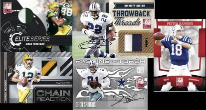
First Look: 2010 Donruss Elite

Photobucket

I have never been a fan of early release products mainly because of the lack of the rookies in their nfl uniforms, an overabundance of bad designs, and tons sticker autos. This set is usually one of the first off the presses, and last year was nothing short of a complete crapfest that broke all of my rules. The cards looked horrible with the electrical storm background, the swatches were grossly out of place, and the whole thing was parallel after parallel.

This year’s set preliminarily looks a lot better because of a more simplistic design with less confusing lines and better layout. The subsets look a better as well due to less swatch placement issues and better looking cards – so far. The problem is that we are STILL going to get those stupid ass signed manupatch things, the set will be 100% foilboard, and im sure these will ALL be stickers. Typical Panini stuff. I really wish the companies would wait until after the premiere to do their second sets after the normal draft set, but it looks like Panini and UD will both continue the pre-premiere onslaught.
Regardless of how much better this looks than last year’s abomination, there is nothing new about Elite. The Torch autos will still be the chase, all the subsets are the same, and there probably wont be any cards worth paying 100 bucks a box for. At least they are offering one good auto per case, but from what I remember, the cases are expensive and have large configurations.
Prestige Chrome Elite is stale beyond believe thanks to years of producing EXACTLY the same crap year after year. At least Bowman Chrome, a set functioning on a similar concept, looks good each year, adds a few things here and there, and maintains a low price point under 60 bucks. Elite does none of those things. Thats why I love the Chromes and stay far away from this.

Panini Takes ‘Bush League’ To An Unprecedented New Level

When the signatures on your cards look like this, its probably best not to display them. It makes me wonder if these are actually just the good ones, complete with bubbly and streaky signatures across the board. Could there be worse ones out there? What the fuck are they thinking? Those horrible looking sigs sure dont complement that awful design very well.

Now, with preliminary reports of Gridiron Gear being a complete and utter waste of space, Panini really needs to re-evaluate things if football is going to continue to be viable for them. For fuck’s sake, these guys are complete fucking amateurs. How long until SPA again?
CLICK TO ENLARGE:


2009 Limited Is Live!

Over on the blowout forums, there is already a six box break of limited that has been posted. Although the base cards look like they were produced on set during the Empire Strikes Back, the limited patch autos that are always the focus of the set look AWESOME. At least, as long as most of them look like these:


HOW FUCKING COOL ARE THOSE TEAM NAME CUT OUTS? I will stand by the fact that the NFL word variant logos are some of the best logos in sports, and I applaud Panini for using them as a diecut pattern. So awesome.
Also, the Limited Slideshows look good as well, busy as hell, but defintely better than last year. Here are a few that were posted:
Yet, for every good looking card in the set, there are ones that look like pure Panini poop. And when I say poop, I mean nasty ass mudbutt shit. The kind that just reeks up the whole house.
I still wouldnt buy any boxes of it, but I definitely will be looking for some singles. Here’s hoping that there arent any more Harvin redemptions.
EDIT: Hakeem Nicks is a redemption. Now seriously, you had these rookies at the premiere for one sole reason: TO SIGN THEIR FUCKING STUFF. Extremely poor planning that you dont have the ROOKIE sigs all ready to go after that. You know the needs you will have, you know that they will be a captive audience to sign everything, so why didnt they sign? The fact that there are redemptions for these STICKERS is absolutely fucking ridiculous.
FAIL.
EDIT 2: Percy Harvin is also a redemption. What the fuck? How poor of planning can it get? EPIC FAIL.
EDIT 3: Tyson Jackson is the third player AT THE FUCKING PREMIERE to have redemptions in Limited. HO-LEE-SHIT. LEGENDARY FAIL.

National Treasures: How The Mighty Have Fallen

I just received some of the National Treasures images posted by Panini from a member over on FCB. Sadly, Panini has taken a product that once looked elegant and clean, and turned it into a high end version of Donruss Threads. Panini lovers will love this new direction, but to me, it takes everything that National Treasures used to be and takes a huge dump on it. Its gotten to a point beyond disappointment, more anger than anything now.

First, I want to start with the one card that I think looks awesome.
I absolutely love this card. Love it. The idea of the card is great, the design is great, and although its still a sticker auto in a $500 MSRP set, its still awesome. I would buy cards from this set in a heartbeat, this is the one thing that made me optimistic.
This card features a great group of players, but the design is straight out of a low end set. Busy, small pictures, and floating swatch windows. The card is also incredibly top heavy, and I cant believe this is going to be one of the subsets in NT.
This one isnt bad, except for the fact that the lines and blobs in the back look weird and the text on the side is all strung together like a run on sentence. Not bad, but not NT worthy to me.
I think this card may be straight out of Playoff Prestige. It just looks awfully conceived with odd placements of borders and lines that make absolutely no sense. Also, not really sure why there are two cowboy logos on here when the player pictures are less than an inch big.
This card looks better than the Emmitt/Aikman card, but the background draws so much away from this card. One of the things that made previous incarnations of NT so cool, was that it had an old fashioned type feel to match the focus on retired and star players. This looks like photoshop barfed on the legacy of these two players and I am extremely turned off by it. Why is it like this set has turned into National Transformers: Revenge of the Fallen?
Again, I am sad because of what Panini’s horrid design team has done to this once amazing set. 2006-2008 National Treasures was awesome, I have a lot of those cards, I would buy more of those cards. I would never in a million years spend $500 on a box of cards that look like this, when I can spend less than a fifth of the money and get the same thing out of early season Panini crapfests.
I sincerely hope the rest of this set looks better.