Category Archives: gridiron gear
First Look: 2009 Donruss Gridiron Gear Football
In 2007, Gridiron Gear was one of my favorite sets of the year, but in 2008, it dropped well below acceptable standards to me. The continued use of event used footballs, as well as a RC Patch auto design that didnt lend well to parallels sold the product down the river to me.
I see a lot of 2008’s product in 2009’s preview, which concerns me, in addition to ANOTHER Donini set with sticker autos, despite a focus on hard signed products elsewhere. Gridiron Gear is like SPA and Limited is like Ultimate in terms of the release calendar, and both are at a disadvantage to UDs sets before a preview is even released. See, I love UD products because they are the best, its not even a contest, especially when Donini continually falls short of product expectations.
Ill give you an example.
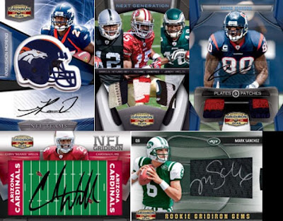
Instead of retiring lame gimmicks like signed plastic NFL fields, and cards with rubber helmets embedded in them, they are issued as a staple in the product. I cant tell you how bored I am with these cards, even when they were created in 2007, and it makes me really frustated to think how lazy the Donini designers are. Why not focus on the design of the Gridiron Gems to ASSURE that every parallel fits into the design. It didnt last year, and from the preview of the sanchez here, this year’s is the same. Look at the tapering of the window in relation to the design. It looks off, because the card was actually designed for the other parallels. This fact, in turn, makes the window look like it is breaking through the borders of the card.
Here is the reality I see in Donini cards for 2009. Who ever is designing them was just given the old set and adobe photoshop and told to reinvent. Rather than starting from scratch as UD and Topps usually do, they just tweak little parts of the old cards. Im guessing its because of a lack of talent/lack of knowhow in the designers’ repetoir, but it could just be that they have no resources – hence all the stickers.
As I said in my UD bias post, I give them more positive press because they are just better at making cards. Donini and Topps are second tier when you hold up the calendar against each other. Sadly, the second tier is second class in this case. Ill take SPA and Ultimate over Limited and Gridiron Gear every day of the week.


