How Not To Do A Cut Autograph

For some reason, over the last year, cut autographs have gone from awesome pull to fucking ridiculous pieces of shit. When I mean fucking ridiculous pieces of shit, I mean that some of them dont break five dollars. Its not necessarily due to lack of rarity, but that is definitely a factor. I think its just as much a testament to the awful and disgusting designs that have overtaken the cut auto market.

Bad

This is a cut auto out Panini’s recent release of 2009 Limited. In previous years, Limited cuts have looked like this, this and even this. Not necessarily that bad, right? Then we have this:

No more picture, looks like a soccer ball, done for the sake of doing it. At least there is a team logo and the colors are based on the team’s. Since Panini puts fucking rainbow foil on everything, this card was not spared, and good lord is it bad. Unfortunately, this is the best of recent cards, and yes, it gets worse.

Awful

Upper Deck is usually thought of as the innovator and perfector of the cut auto. Their Legendary Cuts baseball product has always been a collector favorite. Recently in UD Black, all of that history went out the window so quickly that my head spun as I was projectile vomiting. Now, with newly painted walls, feast your eyes on this abomination:

No picture, odd looking hand numbering, and a weirdly shaped window that does nothing to help the cause. Just awful. For a set that looked as good as black did, there is no reason to include cards like this. I think this is the quintessential card to show that companies are now using cuts as a way to lure collectors in while delivering very little. Sad.

Fucking Horrid

Triple Threads is one of my least favorite products of all time, without question. However, even I could not believe my eyes when I saw this next card. It takes the whole cut autograph concept and just sets it aflame. Its so bad that you may want to take any children out of the room before continuing.

I dont know where to start. First off, the card is printed on bright blue neon foil. Im sure Vince Lombardi would have been proud. Second, those “relics” are from seats of the old Packers’ stadium, and I am not sure why this card even needed “relics” in the first place. Fucking stupid. Lastly, we have the crown jewel, the cut itself, and I cant even find a way in my mind to get the card the way it turned out. Obviously this is a check, but they mangled it so badly that you cant even call this his autograph anymore.

Seriously, if this is what we are forced to endure with cuts over the next few years, I want them gone. This has gotten to a point of parody, and I am not pleased that this is the direction things are headed. At least pay the money to put a picture on there, make the cards rarer, and dont use them in every fucking set. All three companies are such horrible offenders of this crime, that hopefully there is still time to make it back to the way things used to be. Wow.

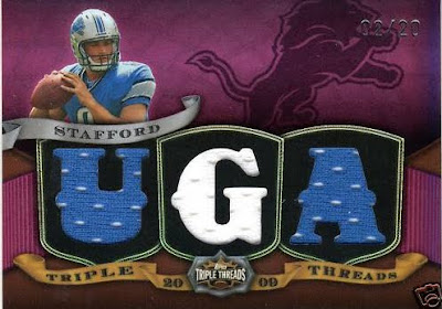
2009 Triple Threads Is Live, Horrid, Ugly, and Whatever Other Adjective You Can Think Of

Everyone who is a regular reader of this site knows of my personal hatred for the worst set ever conceived/produced on a regular basis. Triple Threads is a crime against collecting, and no surprise, the fucking Joe Collectors love it to death. I guess if you love paying 170 dollars for stickers autos built into the design, ugly concepts, and needless diecut relics shoehorned onto a packed card, this product is for you. Now leave my site forever, as your “kind” isnt welcome here.

The first cards of the year showed up today, rainbow neon colored foilboard and all. I didnt think they could get any worse than last year, but just like Topps always does, they found a way. Who could pass up quarter sized pics of the players with a medival theme? I mean, this stuff is ROZDUCULOS, right?


People who buy this need their heads examined.

First Look: 2009 Topps National Chicle Football

(CLICK TO ENLARGE)

The sad fact is that Topps opted to make this set after the Chicle cards in Topps Flagship, Topps Chrome, and UD Philadelphia were already out on the market. The even sadder thing is that these cards dont even compare to the ones from their base set, and they sure as hell dont compare to the ones in Philadelphia, so why even try?

The bordered sticker spaces on the autograph cards cut into the picture, and just draw attention to the fact that there is a sticker on the card. Why not just slap the sticker on the card without the border? It would look a little better than it does, right? With UD Philadelphia offering hard signed cards with better designs, this just isnt going to compete.
The dual looks borderline racist for the Moss painting as he kind of looks like those 20’s era depictions of black people on theater posters. Of course, it wasnt meant that way, but im not sure why they would use that particular painting for the card. Then when you factor in that BOTH the Brady and Moss paintings look weird, and feature bordered sticker spots, the card just looks even more awful.
National Chicle is going to suck from what this is showing, and I think I should use an example of what the autograph cards should look like versus what they do look like. Its a stark comparison.
EDIT: I just saw this one, and I almost spit my coffee all over my computer. Obviously Topps’ wonderful design team wasnt thinking too clearly (The Perez Hilton crap is my addition, though I think it adds to the overall presentation).

First Look: 2009 Bowman Sterling Football

Well, Voluntarheel is going to be very happy with this preview. Personally, I think Bowman Sterling is a ridiculously priced Topps High End set, though people think it is still worth their time to break. This year, it looks like they ditched the horizontal, helmet off, foil sticker cards and made them vertical, helmet on, foil sticker cards.

The cards may look better this year, but the price will still be fucking astronomical for what you get. Basically, it breaks the golden rule of Topps products, so just buy the good looking singles.

The update to the design does look BETTER, ill give them that. However, it does remind me of those ruler designs you do in highschool during boring classes. The bottom looks like spirograph. Not much else to say for me.

h/t FCB

First Look: 2009 Topps Chrome Football


(CLICK TO ENLARGE)

Topps Chrome, the last existing Topps set I even consider purchasing has release sell sheet info. After last years worthless calendar of products like Lettermen and Triple Suck, I have lost complete faith in anything with a Topps brand name on it. When the sell sheet was posted on FCB, I took a long hard look, and was hopeful for the first time in a while. I think the cards have the possibility to look great, a huge improvement over 2008. 2007 was still the best in recent memory, but if these turn out as good as they look on the sell sheet, it could come close. Last year, the price was lowered as well, which made this product affordable again, and I bought my fair share. If that continues, I will continue to buy, much like the rest of the poor people like me.

On to more important things, mainly, if the Rookie Autos are on card autographs, I may poop myself. I have been waiting for on card chrome autos for so long that it hurts. If Topps were smart, they would get these on card, because the curved auto space will be AWFUL with a huge straight foil sticker. Think about how that will look, the corners protruding out into the player picture. Gross. Maybe we will get lucky and Topps will actually do something right for once. I know, not likely.

Also, the RC Patch autos are back too, and out of 25 as they were last year. I found this completely unnecessary, but people seemed to like them. In a product like this, pulling one of those is like pulling a 1/1 out of base Topps, but it is worth mentioning.

(Just in case you were wondering, the cards pictured here are mock-ups, airbrushed pictures, and OTA pictures. These are not the actual pics from the product.)