Panini Does Something Right: Why Impeccable Works So Well

Its rare that Panini can release a set that doesnt literally make me wretch. There are just so many things that drive me up the fucking wall with them, and I wanted to make sure I detail exactly why Impeccable works. It still has A TON of issues, but this was the first product this year that I actually started watching eBay again for singles.

The Use of Action Photos With NO Posed Garbage

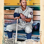
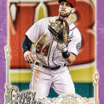
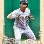
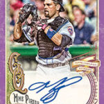
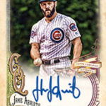
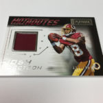
As far as I can see, there is ZERO use of the posed photos that plague Panini products like a virus. They chose nothing but action shots and it looks a million times better. What would you rather have? A rookie in action from the Rookie Premiere, or the one that looks like someone told them to stand there awkwardly while they get a few pics? Its not even close. Rookie Premiere action shots might not be real game photos, but its better than those horrid photos of a player gently cradling a football.

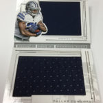
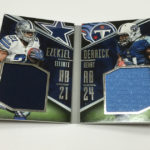
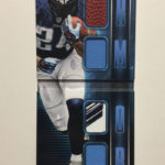
2016 Impeccable Dak Prescott Dual Relic Auto /75

2016 Impeccable Ezekiel Elliott Dual Relic Auto /75

2016 Impeccable Carson Wentz Dual Relic Auto /75

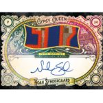
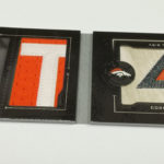
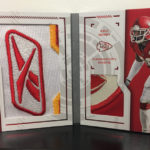
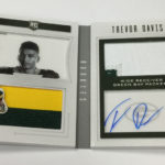
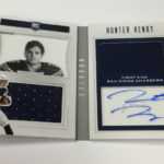
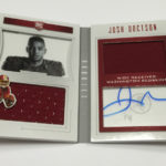
No Design With Separated Autograph/Relic AreasĀ 

Panini has an absolutely unhealthy obsession with separating every element to a card’s design and building boxes for autographs especially. The segmentation looks amateurish and awkward, and rarely works as well as just fading out an area for the player to sign. Some products, the big boxes are so bad, it covers a ton of the design. Obviously, this leaves little for the rest of the elements, so everything looks squished together.

These are much better:

2016 Impeccable Aaron Rodgers Auto Relic /5

2016 Impeccable Barry Sanders Auto 2/2

2016 Impeccable Joe Namath Auto /12
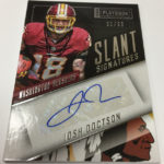
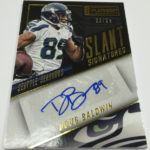
No Stupid Set Names

For the record, I think Impeccable is a dumb name for the overall set. Like Flawless, Immaculate, Unparalleled, and others, Panini thinks that presumptively speaking to the set quality with a name that simulates perfection is so, so fucking idiotic. Flawless has flaws. Immaculate is great, but its not perfect. Unparalleled has lots of parallels. Impeccable is quite nice, but I have to say that the name is a detriment. All that being said, it literally has a pretty uneventful subset naming convention, and that is fine by me. For a company that recently named a set "Slant Signatures" because the stickers were at a slant, you see what I mean. Impeccable Seasons, Elegance patch autos, all fine. Action Autographs in Gala football? Yeah, that’s more typical.

Organic Product Design and Format

The ONLY other set I have bought anything of this year is Origins, which by its very definition is Topps Inception with a different name. The only other products that Panini has done in the last few years that I have bought any of are all from their Basketball team. It has literally been YEARS since the Panini football team has created anything worth a damn. Pretty terrifying when you think about it, as the football team was in desperate need for a victory, and this is the first set that qualifies as one for me. It looks different than anything they have done for a while, and definitely makes a good use of the super premium space that this takes up on the calendar.

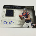
Mostly On Card Autographs

The fact that Panini still makes super premium products that still use stickers is horrifying. National Treasures has more stickers than any other product in its space. Even Immaculate has stickers. Flawless is the only 100% hard signed product Panini makes, and that is fucking ridiculous. Topps released a few completely hard signed products last year, and High Tek did it at less than 70 bucks a box. Stickers CANNOT be the exception, and Panini makes people pay crazy money for anyone who wants on card autos. Impeccable has a lot of hard signed cards, but the stickers are still a part of this set. Funny thing is, it has taken them until week 6 of the year to get ANYTHING hard signed from the rookies in NFL gear. Sad.

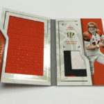
No Crazy Patterned Background Stock Designs

Look at Spectra (BARF), look at Unparalleled (DOUBLE BARF), look at so many other trashy sets that Panini literally ruins with the insane background stock patterns that would make the old Trapper Keeper designers a bit uneasy. This is straight up and simple, which is so much better than anything that can be accomplished with stupid looking lava waves or whatever the fuck that is called.

After Impeccable, we have Prizm, which actually doesnt look 100% terrible, despite the funny looking posed photo cards they previewed today. After that, its a lot of rough waters until Immaculate and Contenders. Panini has literally shit the bed on 2016 so far, but I cant take away much from what they were able to get out of Impeccable. I still find it absolutely depressing that I need to get this excited over a product that both Topps and Upper Deck would be considering as standard for their effort. For Panini, this is the cream, and they should be ashamed that they are in this position. Its no wonder that so many shop owners are down this year.

Go Live Report: 2016 Impeccable Football

2016-impeccable-football

Its rare that I am going to get on here and really give Panini something to smile about, especially for a product named fucking “Impeccable.” The name itself should doom this product to the depths of hell, but hot damn, even a broken clock tells the right time twice a day. Panini literally sucks at building new products, and this is the first time I have been impressed with something that is unique to football. Of course, its not an accessible product at all, because god forbid, they make a nice AND affordable product.

Here is what is on the market so far:

2016 Impeccable Football Carson Wentz Auto Relic /75

2016 Impeccable Football Jerry Rice Jumbo Patch Auto /5

2016 Impeccable Football Ezekiel Elliott Auto Dual Relic /75

2016 Impeccable Football Aaron Rodgers Auto Numbers

First off, despite the name, I love the design. It looks similar to Museum Collection in a lot of ways, and when Panini rips off Topps, things usually work out. Most of the autographs are hard signed, which is a big reason why I am on board, but the black background and lack of goofy ass posed photos is a big benefit here.

In terms of the layout, Panini is literally borrowing directly from the book of plays I love, and that is LOOOOOONG overdue. Big player photos, nicely laid out cards, and a lot of reason to get excited about buying singles. At five autographs a box, that isnt a bad configuration either, but honestly, its so difficult to support a product that should have been available at a much lower price point with less content. Panini is so entrenched in creating products for Group Breakers that its hard to really dive in on their wax at any level, and that is horrendously frustrating.

Either way, Impeccable is easily the best product Panini has made this year, and it is worth your time to check out singles, or buy into a group break or two. Outside of that, im still not sold on Panini high end anything as a breaker’s treat, unless you are working in a group setting. Even besides that, its worth looking into your player targets to get some good PC pieces that will make your collection stand out.

On the Radar: 2017 Gypsy Queen Baseball

When it comes to delivering hard signed content, Topps’ retro slate of products rarely under delivers. Ginter has been a top product for more than a decade. Heritage is something that collectors rabidly chase year after year. Gypsy Queen has been under appreciated by collectors when you look at the other examples in this line of sets, but man, the cards have never looked better over the last few years. On card autos, great signed relics, and some really cool content all around. Its like Ginter with straight baseball. That might actually be the one thing that is holding this product back, it just isnt what the others have become.

Here are some of my favorites from Gypsy over the run:

2015 Gypsy Queen Mike Trout Red Auto BGS 9.5

2012 Gypsy Queen Sandy Koufax Auto

2015 Gypsy Queen Masahiro Tanaka Hand Painted Patch Card 1/1

2014 Gypsy Queen Bryce Harper Mini Auto 5/5

Unfortunately, I really dont like the look of the base and the autographs this year. There are some other cool cards in the preview, but the overly ornate artwork just doesnt do it for me like it has in years past. I really like that Posey laces autograph and the Syndegard tri book, but the rest look terrible. Considering this is more of a combo set collector product and high end hit chaser release, its kind of surprising they are rolling with the same format give or take.

I would actually be pretty curious to see what Gypsy would look like at either extreme of the spectrum, either going super premium or super low end, maybe incorporating a digital element similar to what we saw with the Bunt product from a few months ago. Bottom line, I really like what this set has been over its entire run, but it just hasnt lived up to what we are seeing on the fan base for its brothers and sisters.

Because Topps already has a stable of awesome products in this area, and Gypsy could be an opportunity to take some big risks to differentiate the offering. The cardinal sin of this hobby is overusing a particular idea or type of card, and I think we could be getting well past that point with the strategy that they are using for right now. Without being truly innovative, its hard for collectors to justify ANOTHER expense in this area, and this is a chance to make a retro splash.

Check out the goods:

2015-16 Flawless Basketball is Live

Panini wants to make Flawless into their version of brand immortality, similar to what Exquisite has become. Much to their chagrin, I would say that they are much further away from that than they expected, and they might not be alone in the NBA market if rumblings turn out to be true coming up. I have never been all that impressed with what Flawless brings to the table, other than a better checklist of players, and that hasnt really changed. All the cards available in the set are nothing that hasnt been done before, and I dont think that its fair to expect consumers to foot the bill when that is the case.

Here are some of the hits up so far:

2015-16 Flawless Kristaps Porzingis Auto Patch /15

2015-16 Flawless Stephen Curry Dual Patch Auto /5

2015-16 Flawless Karl Anthony Towns Jumbo Patch Auto /25

2015-16 Flawless Kyrie Irving Jumbo Patch Auto /15

2015-16 Flawless Lebron James Jumbo Patch /5

Although the checklist does offer better shots at Kobe and Steph Curry, the lack of Jordan and Lebron remains a detractor, above and beyond lack of insanely unique cards. I just dont see how this set in delivery is any different than Immaculate or National Treasures, and box break format isnt going to convince me its worth dropping a rent payment on a few cards. At least they have brought logos to the product, but Immaculate and Treasures have had them for years. I dont see multi signature or logo cards that measure up to the ridiculous price tag, and I have to believe that if collectors had other options in the ultra-premium space, they would see how little effort Panini puts into Flawless.

That’s the whole thing here – there are no other options, and collectors are forced to deal with what they have, so Flawless has buyers. It helps that Basketball is a highly premium sport, and Panini is definitely taking advantage. The question is what might happen if there were other sets? Ones that capitalize on the lack of unique content that Flawless has swung and missed on? Now we are talking!

As we saw with Flawless football last year, Panini expects us to look the other way when costly content is removed but the price still goes up. Big reason why Football doesnt look to have gotten much traffic from anywhere outside of group breaks. Box price alone cannot dictate secondary market value. You need special content.

I really do like some of the designs, but that shouldnt be the exception on this stuff. So much of the rest of the product is under designed and over foiled. Just look at the dual patch cards, absolutely boring and hideous. If collectors are forced to endure this configuration, at least do more design than a bunch of foil on a stark white background.

Basketball collectors and Panini apologists might disagree with my assessment, but you and I both know that if Upper Deck or Topps ever came back and really created some content in this space that was worth consideration, you know it would make this look like low effort garbage with gimmicky gems in the cards.

2016 Playbook Football is Looking Absolutely Terrible

You know, prior to 2014, I actually didnt mind the concept of Playbook, even with its absolutely stupid configuration. 2012 Playbook was good enough that I actually bought a few boxes chasing down the big hits, and the cards looked pretty good when you remove the typical Panini trash that wasnt the booklet cards. That's not saying there werent par for the course type of worthlessness, but it was offset by nice stuff other places in the set. In 2014, things went completely south, and only got worse in 2015. So bad that they started putting stickers on the main box hits instead of hard signed acetate scraps. If you think about it, they literally took a sticker replacement and added a sticker to it. Acetate scraps are signed prior to the card’s creation, which is why playbook can avoid sticker usage, and then to see them go that direction is fucking perfect. Just pure Panini.

Check out some of the nicer cards from this set over the years:

2011 Playbook AJ Green Booklet Auto Patch RC

2013 Playbook Down and Dirty Julio Jones Booklet Dual Patch

2012 Playbook Andrew Luck Booklet Auto Patch RC

Now look at what it has become as of a few years ago:

2015 Playbook Jarvis Landry Booklet Sticker Auto Patch

2015 Playbook Randall Cobb Relic Auto

This year’s playbook is right down the same path, with so many poorly designed and concieved cards, that it almost seems like a joke. Its like Panini is trolling us, just to see how low they can put the bar. At some point, even their most staunch supporters will nope the fuck out of every product they put out, and then all will be revealed. We should have already gotten to that point with Gala, Spectra and Unparalleled, but for whatever reason that didnt happen.

The worst part about 2016 Playbook is the terrible look to the main box hits, which are so fucking boring that even the players look bored in those horrendous head shots they are using on the left side. They literally arent even trying anymore.

Then, you see Slant Signatures. This is where things get downright comical. Panini decided it would dad joke the hell out of a set by putting the stickers on a slant and calling it “Slant Signatures” to refer to the way the card was designed. I cant make this up. I wish I was. At what point are you so strapped for ideas that you design a card like this, only hoping that people hear the implied “see what I did there?!?” type of garbage that makes this whole product as shitty as ever.

Right now, Im so busy that I havent had as much time to keep up with the site as I had wanted, but hot damn, I needed to roast this turd of a box before it ate me alive. This was the first time since eBay bucks started that I didnt accumulate any from buying physical football cards, and seeing set after set where Panini just squats and squeezes one out should be a clue as to why that is the case.

Only Panini folks, only Panini indeed. Check out the damage.