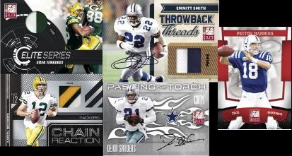
I have never been a fan of early release products mainly because of the lack of the rookies in their nfl uniforms, an overabundance of bad designs, and tons sticker autos. This set is usually one of the first off the presses, and last year was nothing short of a complete crapfest that broke all of my rules. The cards looked horrible with the electrical storm background, the swatches were grossly out of place, and the whole thing was parallel after parallel.
Category Archives: panini-nized
National Treasures 1/1s Popping Up All Over The Place on Ebay
There are a bunch of cool looking 1/1s that are popping up on eBay, though some of them are not living up to the standards set by 2007 and 2008’s. We know that the Robiskie 1/1 Logo Patch auto has been pulled on blowout, and now the Josh Freeman is up on eBay. In addition, there is also another Robiskie that is out of the colossal patch set with no auto
, as well as a Moreno Tag Patch Logo 1-of-1
, meaning there is many more logos in this product than there should be for the rookies. Funny enough, over a quarter of the “colossal” set has swatches that are smaller than the normal ones for the rest of the set.
2009 National Treasures Is Live, Threads-y
Its Tuesday, and that means that 2009 National Treasures is hitting eBay. I have voiced my disapproval of the direction that this set has taken, and it is becoming that much more apparent now that more cards are hitting eBay. This product used to be about great looking cards with an old fashioned focus, all of which has changed to an overpriced version of Donruss Threads and Rookies and Stars.
Back in 2006, NT was DLP’s answer to Exquisite Collection’s massive success, but now it is put out only to continue the tradition of super high end. In my opinion, with the way that Upper Deck runs Exquisite (all on card, lots of autos, continuity of the main parts of the set, etc) National Treasures has actually become more of a competitor with SPA in terms of value. Collectors expect new ridiculous things out of Exquisite, they just expect National Treasures to be there every year. Oddly enough, National Treasures’ biggest problem is that it has yet to employ the practices it needs to on the high end autograph front. This is pretty much the main factor behind its lack of competition, with design now added into it. With UD featuring as many on card sets as it does, NT hassnt been able to live up to the hype. In a 2006 world where everything was stickers, it was different, but now, UD has set the bar too high for them to reach in that respect. Hell, UD even managed to get on card stuff into the lower end of things with Philadelphia and UD Draft, and that is in boxes that don’t include 400 dollar price tags.
The way that DLP always competed for business with its high end was in the design it used for the product. It hearkened back to the mahogany and painted feel of an antique item, focusing more on the history of the game than the rookies. Rookies were a part of it, but the focus was on the “treasures” of football. In 2007, things started to move away from that, while still keeping the soul of the 2006 product. In 2008, the design was still very good looking, and featured a lot of tributes to the original set. In 2009, all is out the window, and it looks more like an overpriced versions of the lower end sets that DLP puts out every year – minus the foil board.
Don’t get me wrong, the Rookie Auto Patch cards don’t look bad outside of the bubbled on card sigs, but the rest of the set might as well have been National Gridiron Gear
or National Rookies and Stars
. Instead of focusing on the parts that made the previous sets great, they focused on the rookies and cheap ways to say that NT features on card sigs, when really 90% of it is stickers in a 400 dollar product.
They may think that they can blind us with jumbo logo patches of the 2009 rookies, but even the JCs are not fooled by cards that normally made them salivate in previous years. This years National Treasures is a horrible attempt at an overhaul, and you can bet that things will need fixing if Panini expects to stay in the deep end of the super high end pool.


