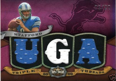
Worst of the Worst 2004-2009 #3 – 2007-2009 Topps Triple Threads

Everyone knows how much I absolutely despise Triple Threads, but it only made it to number 3 on this list. That’s how bad the top two are. In my opinion, this shit house of a product is one of the longest running crap fests in the history of the hobby, stemming from 2007 through 2009. Usually, if a product is bad, they dump it before losing face on another year’s worth of bad cards. Not so with Triple Threads. This product has somehow built a following with Joe Collectors hobby wide, who have cared more about how many “relics” and stickers you can stuff onto a card than how it looks when its done. In fact, many of them consider it to be the best product ever made. How they have kidded themselves into thinking that is beyond me.

First, lets start with the format, because this is where most of the JCs even have problems with this product. For the price you would normally spend on a box of a vastly superior product, Triple Threads gives you absolutely nothing. Your first hit is a triple jersey card, most of which are from back end rookie premiere players, or oddly comboed triads of “related subjects” (I use the term related loosely). These cards are usually one color swatches of material “not from any specific game or season.” These cards can sell for less than the cost of some of the base parallels, and rarely get you back any of the cost of the 100 dollar MSRP pack. Your second hit is an auto, which over 75 percent of the time will be a crap rookie. This means “getting Simpson’ed” runs rampant in this product, more than any other product of this cost bracket. Just for comparison, here are some other products and their cost, and how they relate to this product:

Topps Triple Threads 170 dollars, 1 auto, mid range resale value

SP Authentic – 120 dollars, 3 autos, high resale value
Leaf Limited – 80 dollars 1-3 autos, mid range resale value
Ultimate Collection – 80 dollars, 1 auto, mid range resale value
Leaf Certified Material – 80 dollars, 1-2 autos, mid range resale value
Topps Chrome – 50 dollars 1-2 autos, mid to low range resale value

When you look at it that way, things get crazy. Topps Chrome uses better designs, the same stickers, and people love it, yet the box costs less than half of what a Triple Threads box costs. The format of this product is ridiculous and justifies a spot on this list, but wait! There’s more!

The design of this product is one of the worst in the industry, year to year. Since 2007, the cards have changed so little that some people cant tell the difference between an older card and a newer one. The layout that Topps’ design team chooses is always a combination of neon colored rainbow foil, huge swatch windows diecut with odd words and phrases, tiny player pictures, and foil auto stickers that are recessed into the actual design of the card. Yes, despite being a high end product, Topps still wants us to look directly at the gaudy foil sticker.

I havent even started with the fold out cards, which have proven to be the worst part of this worst of the worst set. Because Topps couldn’t find enough room on one card for their junk, they needed find a way to STUFF more crap onto an extra card that is connected to the first one. Actually, there are now TRI-fold cards in this years product because two werent sufficient. Wow. Don’t even ask about some of the weird ass phrases they try to confusingly spell out with die cut windows. More space = more confusion for these.

Then we have parallels. So many parallels that I cant even name them all off. They all have their own neon foilboard color, and some even spell out more stupid shit. Each card has at least 10 parallel versions, 4 printing plates, a 1/1, and as many prime versions. Each player can have up to 4 different designs for the set, and when the top level is as high as /199, things can get fucking crazy.

If this was a contest for worst product of the year, Triple Threads would be at the top year after year. Its just the worst product ever conceived for a long run in the industry. Sadly enough JCs buy and melt for this product that it should continue in Baseball, but luckily for us, football is done after this year. Maybe Topps will put out one last set just to fuck with me. Funny enough, this set spawned the golden rule of Topps. This is what started it all.

I actually wish I had the intellectual fortitude to continue writing about this product, but it is so bad that I am choking down the remains of my breakfast from two hours ago. I can only imagine what I will have to go through for the set up next.

How Not To Do A Cut Autograph

For some reason, over the last year, cut autographs have gone from awesome pull to fucking ridiculous pieces of shit. When I mean fucking ridiculous pieces of shit, I mean that some of them dont break five dollars. Its not necessarily due to lack of rarity, but that is definitely a factor. I think its just as much a testament to the awful and disgusting designs that have overtaken the cut auto market.

Bad

This is a cut auto out Panini’s recent release of 2009 Limited. In previous years, Limited cuts have looked like this, this and even this. Not necessarily that bad, right? Then we have this:

No more picture, looks like a soccer ball, done for the sake of doing it. At least there is a team logo and the colors are based on the team’s. Since Panini puts fucking rainbow foil on everything, this card was not spared, and good lord is it bad. Unfortunately, this is the best of recent cards, and yes, it gets worse.

Awful

Upper Deck is usually thought of as the innovator and perfector of the cut auto. Their Legendary Cuts baseball product has always been a collector favorite. Recently in UD Black, all of that history went out the window so quickly that my head spun as I was projectile vomiting. Now, with newly painted walls, feast your eyes on this abomination:

No picture, odd looking hand numbering, and a weirdly shaped window that does nothing to help the cause. Just awful. For a set that looked as good as black did, there is no reason to include cards like this. I think this is the quintessential card to show that companies are now using cuts as a way to lure collectors in while delivering very little. Sad.

Fucking Horrid

Triple Threads is one of my least favorite products of all time, without question. However, even I could not believe my eyes when I saw this next card. It takes the whole cut autograph concept and just sets it aflame. Its so bad that you may want to take any children out of the room before continuing.

I dont know where to start. First off, the card is printed on bright blue neon foil. Im sure Vince Lombardi would have been proud. Second, those “relics” are from seats of the old Packers’ stadium, and I am not sure why this card even needed “relics” in the first place. Fucking stupid. Lastly, we have the crown jewel, the cut itself, and I cant even find a way in my mind to get the card the way it turned out. Obviously this is a check, but they mangled it so badly that you cant even call this his autograph anymore.

Seriously, if this is what we are forced to endure with cuts over the next few years, I want them gone. This has gotten to a point of parody, and I am not pleased that this is the direction things are headed. At least pay the money to put a picture on there, make the cards rarer, and dont use them in every fucking set. All three companies are such horrible offenders of this crime, that hopefully there is still time to make it back to the way things used to be. Wow.

Triple Threads Continues To Fail

Take a look, take a good hard look and see if you can spot the mistake.

I saw this mentioned over on FCB, and I couldnt help but laugh. Seriously, how pissed would you be if you pulled a card like this and then saw that the front borders were meant for another player? I would fucking flip a shit. Aside from being fucking ugly, this card is VERY valuable due to what it contains. The problem for this guy is that Jonathan Stewart will haunt him for the rest of his life.

It does make me wonder though, does the Stewart one have a Stafford front?

2009 Triple Threads Is Live, Horrid, Ugly, and Whatever Other Adjective You Can Think Of

Everyone who is a regular reader of this site knows of my personal hatred for the worst set ever conceived/produced on a regular basis. Triple Threads is a crime against collecting, and no surprise, the fucking Joe Collectors love it to death. I guess if you love paying 170 dollars for stickers autos built into the design, ugly concepts, and needless diecut relics shoehorned onto a packed card, this product is for you. Now leave my site forever, as your “kind” isnt welcome here.

The first cards of the year showed up today, rainbow neon colored foilboard and all. I didnt think they could get any worse than last year, but just like Topps always does, they found a way. Who could pass up quarter sized pics of the players with a medival theme? I mean, this stuff is ROZDUCULOS, right?


People who buy this need their heads examined.

Constipation Relieved: We Now Have Triple Turds

Wow, the baseball card industry must feel better after the recent Triple Threads Turds preview. I know I always feel great after a big shit, dont you?

Well, in case you were wondering, the cards are up on Wax Heaven and FCB, and yes, they look exactly the same as last year. It still has stupid shit spelled out in die cut form, still has foldout stupidity with 132 different relic pieces in the card, NOW HAS TRI-FOLD Cards from player’s all star practice jerseys, still the same goddamn price point, still has all the poop it always has had.

I cannot even begin to think why people love this stale ass product. Bottom line, it is complete diarrhea in card form. The design has and always will suck, the content of a box is worth maybe 50 bucks TOPS, and yet Topps always sells it for 170. Even if you hit Albert Fucking Pujols as your auto, you may not make back the price of the box. Thats how much this product sucks. On top of all that, you have 5 bajillion 1/1s that make all the JCs out there blow their loads, but makes the rest of the brain having hobby cringe.

Then you have the Ruth/Gherig dual cut, already being hailed as the card of the year. Im not sure why, as it is still a foldout, it is still stupidly designed, and it still has triple threads plastered all over it. Remember, this is the same product that took a signed Mickey Mantle ball, ripped off the hide, had A-Rod and David Wright sign the sweet spot on either side of the Mick, and put it in the card as a 1/1. Grossest abomination ever created. This could be worse.

The golden rule stands: if a Topps product costs more than 100 bucks, DO NOT BUY IT. This product takes it a little further with the massive design fails. Basically Triple Turds was created to clean out the jersey room, clean out the sticker room, and flood the market with illegitamate 1/1s. FUCK THAT.

A boycott of this product would be a great idea.