This is my favorite time of year, as the card season comes to a close. Even though we are WAAAAAAAAY too far past the end of the season, which is both angering and frustrating, I have to believe its for good reason. Both National Treasures and Five Star are on the way, and from recent previews, they both look really good this year. Although I believe Five Star has a vastly superior design, National Treasures is doing what it can to stay atop the mountain. These two sets have been the products collectors chase thanks to high end content, much of which is deserved. Until this year, NT has looked like junk, but sold well, and Five Star has looked incredible, but sold poorly. Doesnt look to be the case this year for either.
Five Star
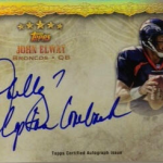
Topps has previewed Five Star for a number of weeks now – but it has been a trickle leading up to the late April release. Today we got a great preview of the signed cards that are completed, including one from my favorite set of all time. The Five Star inscription “quotables” cards are a back for a third year, and every previous version of these cards has been tremendous. The design for the product this year is sleek and simple, which to me is the best combination around.
2010 Five Star Peyton Manning Auto Inscription /10
2010 Five Star Drew Brees Auto Inscription /10
2010 Five Star Brett Favre Auto Inscription /10
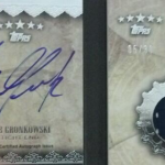
The book cards look better than they have in any of the three Five Star sets so far, even though the swatches are single color in the first few previews of the year. Rob Gronkowski tweeted out his signed cards yesterday, and it only serves to whet the appetite further for the best looking set of the year across all brands.
National Treasures
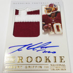
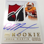
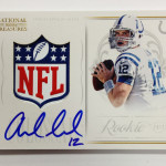
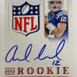
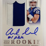
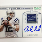
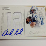
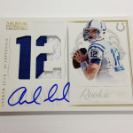
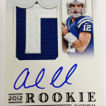
Let me say that I like just about all of the cards Panini has previewed for 2012 National Treasures except the most important one of the bunch. The rookie patch autos look horrendous with the player trapped in the corner of the card, and the vertical orientation doesnt help anything. Although NT used vertical orientation for two years in 2007 and in 2008
, it has never worked well as well as the horizontal ones
.
The National Treasures 1/1 Logo autos fell short of the Chrome Superfractor autos last year for the first time, and with Andrew Luck’s Treasures 1/1 looking the way it does, that should be the case again. I dont think the Treasures 1/1 will come close to this SOLD price with such an undesirable design.
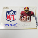
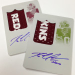
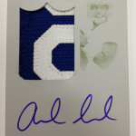
The addition of printing plate autos and other parallel additions are ridiculously stupid to put in a high end product, and I cant wait to see the usual manupatch cloth autos to accompany these atrocities. I also see that Panini is using screen printed logos on some of their biggest cards, which is a disaster – as in the past they have always used the authentic jerseys. Not that it matters when each rookie wears 50 jerseys at the premiere, and another 20 in the private signings.
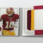
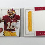
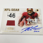
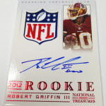
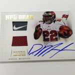
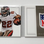
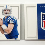
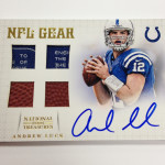
As for the colossal cards, book cards, and NFL gear cards, they all look great. In fact, I think the design used on the colossals should have been used for Auto patch design. They just that much better. Panini is about 3 years behind on the books, which is unfortunate, even though these look great. To see that Robert Griffin III has inscribed a few of his cards is ridiculously cool, even though it looks like they were signed before he was able to inscribe “2012 Rookie of the Year.”
With each banner rookie class, there should also be a banner product year to run along side it. I think we got there on a lot of different levels in 2012. Topps has already gotten off to a fast start with their previews for Inception and Flagship, which I hope will translate well with a weak class. If these two products end the year with fervor, can they help to sustain what looks like a down year? I hope so.

Maybe next year you’ll get an AP inscription of “2012 NFL MVP” that would b awesome!!!
Just curious as to why you think this year will be different for Five Star as far as selling poorly the last couple years? From the previews, it looks more or less the same, doesn’t it? I actually think NT looks significantly better than Five Star this year.
Pingback: Around the Carding Blogosphere for March 29, 2013 : The Baseball Card Store | Hairline Crease