In looking at this product, I am dumbstruck by the boredom and lack of differentiation in the products Panini is puttting out. Playbook is different in that it offers a booklet format, but honestly the approach is the umpteenth product to SCREAM “I AM PANINI GARBAGE” in a row. Panini already didnt make good products, and now we see that Panini isnt even good at making Panini products.
Playbook has had its highlights from previous years, but they are getting lost in recent versions:
2012 Panini Playbook Andrew Luck Auto Patch Booket
2013 Panini Playbook Cam Newton Auto Patch Booklet
2014 Panini Playbook Marshawn Lynch Down and Dirty Logo Booklet
2014 Panini Playbook Doug Martin Game Of Inches Patch Booklet
This year’s design is back to a vertical booklet format, because they obviously want to cram as much as they can into this booklet to hide the fact that they have no chops in making cards. Each of the cards looks amateurish, or just bad, and that’s not even talking about the names they have for the subsets. Yes, someone at Panini thought they should name a set “Slant Signtaures.” When you see how the card looks, it becomes one of those horrible dad twitter jokes that people tell you to delete your account over.
Back when this set was worth buying singles, NO ONE was buying boxes. It has literally tanked every single year it has been around, and yet it is back every fucking season. Even worse, last year they actually had the nerve to put stickers on the playbooks that were left over from other products. Unbelievable.
I mean, these sets are getting so repetitive in the way they are done that I dont really know what else I can say. It is like eating a hamburger for breakfast, lunch, and dinner – eventually you just get sick of hamburgers. Sure, there are some REALLY good ones, but its still a fucking hamburger at the end of the day. What is even worse, is that Panini isnt a hamburger, its the white castle version of it. Some people like it, but man does it have a lot of people that find it disgusting.
Honestly, Playbook isnt the worst product that Panini makes, but that is pretty sad when you think about it. I mean, how do you put that goofy posed picture on the left hand side like that? Its a complete train wreck. I remember in 2013, this set was actually one I thought was pretty okay. Now, its just another white castle hamburger just like all the other garbage. Slant fucking signatures. Fuck. I give up.

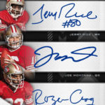
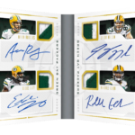

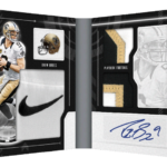

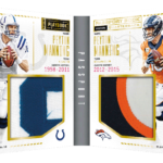
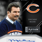

Slant Signatures? I seriously hope that no Oriental players ever find themselves in a situation where they might find their sticker autos stuck to that subset of cards.
Hay I know exactly how this all went down:
Corporate Hack walks into Panini “creative team” meating.
CH: “We keep getting complaints that we are to incompetent to put those crappy auto stickers on straight. What are we going to do?”
Window licking design team member: “Let’s call them slanted signatures. Then they think we done it on portapuss!”
CH: “Eureka! That’s a great idea! Hay arnt you the same guy who solved the problem of the paint explosion a few years back?”
WL: “Yea, I call it SPECTRA, cause it sounds classy!”
CH: “Keep up the good work, you’ll be management soon!”