On Shelves Now: 2017 Spectra Football

Triple Threads is gone from football, but alas, here is Spectra to ruin that absence with a set that looks worse than Triple Threads could ever dream of. Its literally the cardboard equivalent of Lisa Frank trapper keepers, with a design reminiscent of the way Disney treats stickers for their Princesses. Nothing I have seen has had as bad a track record in any sport as Spectra has had in football. The cringe is strong with this over priced trash, and for some reason a lot of people really like it. Im dumbfounded.

Check out this crap:

2017 Spectra Dalvin Cook Neon Green Auto Patch

2017 Spectra Kareem Hunt Neon Pink Auto Patch /15

2017 Spectra Christian McCaffrey / Curtis Samuel Dual Auto Patch 1/1 – This might be the ugliest looking design of the year so far.

2017 Spectra Mitch Trubisky Auto Patch 1/1

Lets start with the stock. Many of the cards, like last year, are printed on stock that features insanely busy patterns and prints, most of which make my eyes hurt. As cool as Chrome technology can be, this is the worst thing any company can do to it. At least the overall design that was used for the year’s card has improved in 2017, but man this stock is like dangling keys in front of a bored baby. Collectors inexplicably go fucking apeshit over shiny dumpster fires, and this is no exception.

Oh, but it gets better.

I can imagine the pitch meeting. Some dude talks about Spectra like its some new breath of fresh air. But the torture of that look wasnt enough, they decided that most of the cards werent going to be hard signed as they were in 2013. Not only that, they wanted the stickers signed in neon paint pen, which I just dont understand the reason for. Its crazy to me that someone threw that out as an idea, and others agreed it was a good idea. What a fucking joke. Yes, in the end, this is a $300 per box product that is built around stickers and neon paint pens. Im not making this up, as you can clearly see. Just let that shit sink in.

Overall, Spectra is as bad as it gets. To complicate things further, Unparalleled functions in a very similar space for a DRASTICALLY reduced price. Contrived scarcity is employed to “create” further value in unimpressive cards through most of Panini’s calendar, and Spectra is the worst offender. Just because someone signed a shitty looking card in pink and numbered it to 2 doesnt mean its unique.

I hope someday, Panini wises up. As good as Origins is (ripped off of a Topps product, natch), Spectra shows the ugly underside of what Panini’s team is severely lacking in talent.

On the Radar: 2017 Panini Impeccable Football

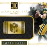
I do not like most of what Panini puts out. Its shitty looking with a bunch of foil and stupid looking photos like 90% of the time. I loved 2016 Impeccable, so, so much. I might even say its the best set the modern Panini team has ever made. Sleek design, great looking action photos, all the things that Panini rarely does well. To see that it is coming back for another year, I am beyond excited.

Check out these beauties from last year:

2016 Panini Impeccable Dak Prescott Dual Patch Auto

2016 Panini Impeccable Ben Roethlisberger Patch Auto

2016 Panini Impeccable Adrian Peterson Auto 2/2

2016 Panini Impeccable Andrew Luck Numbers Auto /12

Panini rarely takes an approach that is understated yet beautiful. Its what Topps had mastered, and Upper Deck before them. Where Panini had often failed, Impeccable has delivered and then some. I love the black and white focused background, with a drive to deliver cards that remind us of the luxury price that is attached to this product.

For a long, long time, Panini rarely put out anything on card. They used every trick in the book to avoid getting players signed on card, whether it was scraps of signed construction paper, or even manupatches. With Impeccable being hard signed almost 100%, it adds a level of allure to the cards that isnt there for junk like Pantheon or Majestic. Both cost a shit ton of money, both are performing horrendously for a reason. Impeccable is different, even though stickers are still present.

I hope we get more of this stuff for years to come. Its that good looking, on the level I usually expect from everyone but them. Not much has changed since 2016, and that is a very good thing.

On Shelves Now: 2017 Panini Origins Football

When Topps was master of the football game, a cornerstone of the pre-season product line was Inception. Starting in 2012, Topps brought special design concepts to the rookie premiere to have players sign on card with retouched photos of them in their pro uniforms. It had never been done before on such a large scale, and in all reality, was a really creative idea. When Topps was forced out football starting last year, Panini took inception and rebranded it with their own name. Because Origins is basically Inception under the Panini umbrella, obviously im a fan.

Check out the top hits already up:

2017 Origins Christian McCaffrey On Card Auto 1/1

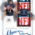
2017 Origins Mitchell Trubisky Patch Auto Booklet /25

2017 Origins Deshaun Watson Patch Auto /99

2017 Origins JuJu Smith-Shuster Glove Logo Auto Booklet /2

2017 Origins Six Way Auto Booklet – Trubisky, Fournette, McCaffrey, Davis, Williams, Mahomes

This year’s set doesnt break from the formula at all, so its clear why the set looks as good as it did last year. Although there are more 00 jersesy than Topps ever had in any year, the concept is still quite solid. I love the on card autographs, and the different ways they incorporate different ink parallels in the identical way Topps did, and the books are super premium pro branded content early in the year. None of this has changed since 2015 Inception, and therefore, its great.

My only complaint is that Panini hasnt taken this to another level, incorporating veteran content or bringing the rookie content a bit more forward. Being that this is a rookie program, there are arguments that Vets have no place – however, thats maybe where Panini can separate this rip off to be something worthwhile on its own. Topps incorporated veteran content through retro photos and flashback themes, and it could DEFINITELY work here too. Again, Panini has not differentiated this brand at all, which isnt a bad thing for people stuck in the past like me, but it doesnt speak all that well of the current landscape.

I bought a bunch of Origins and will continue to buy as long as there is a rookie I collect. I just wish there was a roadmap for this product that has more instructions than Ctrl+C and Ctrl+V from Inception.

On the Radar: 2017 Panini Spectra Football

Spectra is the worst looking and the most horribly priced product that is available in football right now. In 2013, when it first came out, it wasnt bad, offering on card autos on a Chrome like stock similar to Bowman Sterling. In 2014, the design went to shit by a margin usually reserved for botched face lifts. At that point, I thought, “Well fuck, this has to be as bad as its going to get.”

I was so, so wrong:

2016 Spectra Dak Prescott / Ezekiel Elliott Neon Blue Dual Auto Patch

2015 Spectra Buck Allen / Nelson Agholor Neon Pink Dual Patch Auto

2015 Spectra Jameis Winston Neon Orange Auto Patch

2016 Spectra Braxton Miller Neon Green Auto Patch

In 2015 we got our first taste of a shitty design, combined with fluorescent paint pens I would normally reserve for people that like to bedazzle their backpacks. 2016 was basically a sequel to the first, and I continued to be shocked that Panini continued to trot out such a deaf product for a hobby that was hungry for affordable options in the market. Panini didnt need more high end in football, there were already going to be 29-30 other products that were going to serve that purpose.

Alas, here we are again. Spectra is back for another year, and I feel like this is starting to be exactly what Triple Threads means in Baseball. So many people hate the shit out of it, but it almost doesnt matter. You have all those people who love shiny things, even if they look like fucking garbage, and Spectra is for all those people. When I picture the type of person that gravitates towards this, I think of the people who freak out over any autographs when narrating a group break. Its fine if you are one of those people, its good that type of passion exists, Im just not going to see eye to eye with you.

I want cards that serve a purpose other than a bright orange marker on a sticker applied to a neon orange background of a poorly designed football card. This is another year when a super premium product doesnt need to be on card, and I find that completely out of touch. If you are going to make something like this special, it should be treated as such. Not just another set whose only redeeming factor is that it costs a shit ton of money. Invoking contrived scarcity also doesnt help when there are 25 parallels of each card. None of what Spectra has become sits well with me, and it seems like everything gets worse by the year.

Now, we havent even had the chance to digest that they took the dual auto relics, and used those ridiculously goofy portrait style shots instead of action shots. These cards were already the worst looking part of the worst looking set, but some how that wasnt enough for Panini. Gaze upon the shitty design and wretch along with me. That’s some disgusting trash right there.

The rest of the stuff really doesnt look all that bad. I kind of like some of the updates they made to some of these cards. I just get worried that Im due for a neon blue version where I have to wear sunglasses just to look at that card. That’s how Panini does this dumpster fire. Its all about garish colors on a garish design.

Panini, we deserve better than this, and the terrible thing is, I dont think you guys care in the slightest. Some day, you will realize the opportunity you fed to the wolves. At least I hope that’s what will happen.

Topps Releases Two Huge Previews – 2017 Dynasty Baseball and 2018 Topps Series One!

There are only a few things that get the majority of the hobby up and on their feet. The release of the Topps Series One design for the next year is ALWAYS one of them. Coupling that with the release of previews for 2017 Topps Dynasty Baseball is about as hearty a punch of fun as we get these days. Considering that both look exceptionally great, its cool to see what everyone else seems to think.

2017 Topps Dynasty

I thought last year was boring. I didnt even buy any of the singles, and I think it was a missed opportunity to take the brand to a new level with Derek Jeter’s recently added autographs.

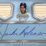
To me, Dynasty is the best high end baseball product Topps makes. It has the best checklist, the best looking cards, and is one of the most interesting case breaks to watch. Some argue the set content is too skinny to be a real force, but I completely disagree. It offers the most premium cards of the year, even with Transcendent in the mix.

Check out these beauties:

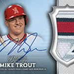
2015 Topps Dynasty Mike Trout Auto Patch

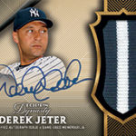
2016 Topps Dynasty Derek Jeter Auto Patch 2/5

2014 Topps Dynasty Bryce Harper Auto Patch

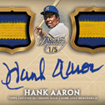
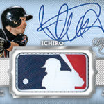
The 2017 design is everything I had hoped for last year, and its going to be enormous with Judge and Bellinger in the mix. We also see more variety in the designs, and the introduction of Triple Threads style MLB logo autos as 1/1s.

I have to believe this will be a limited product as it always is, and the demand for the crazy Judge patch autos will have to be a factor in buying cases worth of this product, and Im curious to see how that will work. We have seen Judge relics in 2017 Inception, but outside of that, not much.

2018 Topps Series One

I thought this year’s design was a bit weak. I just didnt like the criss cross line look for the nameplate, and the way parallels were done were a bit odd to me. Its far from the worst design Topps has done, but its not the best.

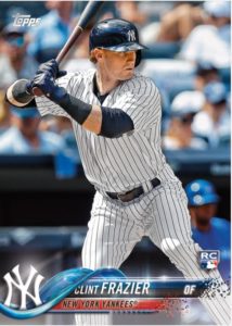
Looking at the 2018 template, I am enthralled with the way Topps has modernized the look of this set. Opting to go with another borderless design and full bleed photos is right up my alley, and the wave like digital nameplate looks sleek and cool. Its hard to picture 2018 being as big as 2017, but there are always surprises.

We still do not have a full preview of the way parallels will work, or any of the inserts, but you can imagine that is coming soon.

I think as we begin to close out the year for 2017 and start to see Topps moving on from a record year, its going to be intriguing to see how they look to manage their designs in 2018. They can either move on from Judge but keep a progressive outlook, or avoid the risk of putting sets out that might not jive with an ultra traditional collecting crowd. Both of these previews definitely strike chord with me, and I hope there is more to come.