Its rare that Panini can release a set that doesnt literally make me wretch. There are just so many things that drive me up the fucking wall with them, and I wanted to make sure I detail exactly why Impeccable works. It still has A TON of issues, but this was the first product this year that I actually started watching eBay again for singles.
The Use of Action Photos With NO Posed Garbage
As far as I can see, there is ZERO use of the posed photos that plague Panini products like a virus . They chose nothing but action shots and it looks a million times better. What would you rather have? A rookie in action from the Rookie Premiere, or the one that looks like someone told them to stand there awkwardly while they get a few pics? Its not even close. Rookie Premiere action shots might not be real game photos, but its better than those horrid photos of a player gently cradling a football
 .
.
2016 Impeccable Dak Prescott Dual Relic Auto /75
2016 Impeccable Ezekiel Elliott Dual Relic Auto /75
2016 Impeccable Carson Wentz Dual Relic Auto /75
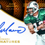
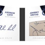
No Design With Separated Autograph/Relic Areas
Panini has an absolutely unhealthy obsession with separating every element to a card’s design and building boxes for autographs especially . The segmentation looks amateurish and awkward, and rarely works as well as just fading out an area for the player to sign. Some products, the big boxes are so bad, it covers a ton of the design
 . Obviously, this leaves little for the rest of the elements, so everything looks squished together.
These are much better:
2016 Impeccable Aaron Rodgers Auto Relic /5
2016 Impeccable Barry Sanders Auto 2/2
2016 Impeccable Joe Namath Auto /12
No Stupid Set Names
For the record, I think Impeccable is a dumb name for the overall set. Like Flawless, Immaculate, Unparalleled, and others, Panini thinks that presumptively speaking to the set quality with a name that simulates perfection is so, so fucking idiotic. Flawless has flaws. Immaculate is great, but its not perfect. Unparalleled has lots of parallels. Impeccable is quite nice, but I have to say that the name is a detriment. All that being said, it literally has a pretty uneventful subset naming convention, and that is fine by me. For a company that recently named a set "Slant Signatures" because the stickers were at a slant , you see what I mean. Impeccable Seasons, Elegance patch autos, all fine. Action Autographs in Gala football? Yeah, that’s more typical.
Organic Product Design and Format
The ONLY other set I have bought anything of this year is Origins, which by its very definition is Topps Inception with a different name. The only other products that Panini has done in the last few years that I have bought any of are all from their Basketball team. It has literally been YEARS since the Panini football team has created anything worth a damn. Pretty terrifying when you think about it, as the football team was in desperate need for a victory, and this is the first set that qualifies as one for me . It looks different than anything they have done for a while, and definitely makes a good use of the super premium space that this takes up on the calendar.
Mostly On Card Autographs
The fact that Panini still makes super premium products that still use stickers is horrifying. National Treasures has more stickers than any other product in its space. Even Immaculate has stickers. Flawless is the only 100% hard signed product Panini makes, and that is fucking ridiculous. Topps released a few completely hard signed products last year, and High Tek did it at less than 70 bucks a box. Stickers CANNOT be the exception, and Panini makes people pay crazy money for anyone who wants on card autos. Impeccable has a lot of hard signed cards, but the stickers are still a part of this set. Funny thing is, it has taken them until week 6 of the year to get ANYTHING hard signed from the rookies in NFL gear. Sad.
No Crazy Patterned Background Stock Designs
Look at Spectra (BARF), look at Unparalleled (DOUBLE BARF), look at so many other trashy sets that Panini literally ruins with the insane background stock patterns that would make the old Trapper Keeper designers a bit uneasy . This is straight up and simple, which is so much better than anything that can be accomplished with stupid looking lava waves or whatever the fuck that is called.
After Impeccable, we have Prizm, which actually doesnt look 100% terrible, despite the funny looking posed photo cards they previewed today. After that, its a lot of rough waters until Immaculate and Contenders. Panini has literally shit the bed on 2016 so far, but I cant take away much from what they were able to get out of Impeccable. I still find it absolutely depressing that I need to get this excited over a product that both Topps and Upper Deck would be considering as standard for their effort. For Panini, this is the cream, and they should be ashamed that they are in this position. Its no wonder that so many shop owners are down this year.
. It was outdated, insanely ugly, and the format really didnt make sense. Most of all collectors wrote it off much the same way that they did with the other shitty mid range products that Panini makes.

