I have a lot of pet peeves when it comes to sports cards, and I feel strongly enough about them that I will forgo buying a PC player card if it doesnt adhere to my rules. I like VERY specific layouts, photos and autograph types, and I am not a person who will give up quality to obtain quantity. With that, here is a list of my five worst types of autograph cards in sports. This is my nightmare!
1. Manufactured Patch Autographs
These embroidered eye sores are a Panini special, and continue to be a part of many products. They arent the only ones who have used these, although no one does it en masse like them. I hate signed swatches in general, but these are the worst of the worst. There too many examples with bleeding ink, players signing in a spot that is covered up, among other things. The card design for many of these is about as bad as it gets, with just a border slapped on the outside ring of the manupatch. What a fucking joke.
Examples:
2009 National Treasures LeSean McCoy Manufactured Patch Auto
2015 Panini Black Friday Julius Randle Manufactured Patch Auto
2012-13 Upper Deck Exquisite Michael Jordan Limited Logos Manufactured Patch Auto
2. The Big White Box or Separated Signature Area
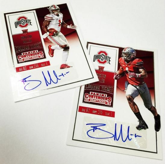
Im sure you guys have seen these cards. Ones where the design of the card literally walls off a place for the athlete to sign, or uses a big white box to emphasize the sticker on a dark background. Considering that some of this issue can be solved by fading out instead of boxing out, I dont get it. Its lazy, its ugly, and it pisses me off. Signature areas should be done as part of the flow of the card, not as its own element. If a designer needs to do this to make the signature pop – DESIGN THE FUCKING CARD DIFFERENTLY. Dont put a dark background on a card that is going to use clear stickers. This isnt rocket science.
Examples:
2015-16 Select Karl Anthony Towns Auto Patch Tie Dye /25
2014 Spectra Teddy Bridgewater Auto Relic RC
2016 Topps Industry Summit Kris Bryant Auto
3. Cut Autographs of Available Signers
This could be any number of things, but its basically a sticker replacement method used in a situation when the athlete cant sign the card directly. Panini has been terrible at this over the years, especially with those horrible black construction paper scraps they have people sign and then insert into the cards. Other companies have used this method as it is obviously a way to avoid stickers.
Examples:
2015 Black Gold Jameis Winston Cut Auto /99
2014 Immaculate Clayton Kershaw Black Paper Auto
2006 National Treasures Joe Montana Cut Auto
4. Signed Letters
Continuing on the signed fabric kick, I have seen letters become so popular that people dont even care that they arent game used. People like spelling weird shit out on their wall, or spelling out their own name, but that doesnt change the fact that signed letter patches are fucking stupid. Many of the team patches feature letters that are in a thinner typeface, which makes the signature area really hard to autograph. It leads to unintelligible scribbles that are much worse that the normal unintelligible scribbles. Enough is enough.
Examples:
2007 SP Authentic Emmitt Smith Signed Letter Auto
2015 Immaculate Jameis Winston Signed Letter Auto RC /7
2008 Threads Matt Ryan Signed Letter Auto RC
5. Acetate Scrap Autographs
Another Panini sticker replacement, and one that has yet to look good. Because the signed scrap needs to have a blank area behind it for the effect to work, a huge portion of the card’s design needs to be obscured. It leads to half designed cards and ugly looking examples, and yet Panini feels the need to put them in EVERYTHING. Sticker autos are only the enemy when on card is possible but not used. When you cant get a card hard signed, just use the damn sticker, dont go this way.
Examples:
2015 Clear Vision Kevin White Acetate Scrap Auto
2015 Panini Threads Andrew Wiggins Rookie View Auto
2015 Stars and Stripes Kris Bryant Acetate Scrap Auto Relic Tag
The sad thing about all of these items on the list is that they are done OVER AND OVER AND OVER AND OVER again. No one ever learns from the egregious mistakes. Every time I see them, I just cringe, and I cant be the only one. Just writing this post makes me nauseous. I need a shower.

