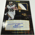
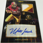
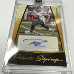
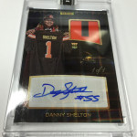
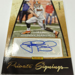
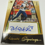
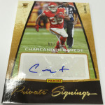
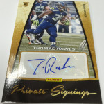
When Russell Wilson won the Super Bowl two years ago, the hobby went freaking bananas over his cards. They have stayed strong with good season after good season , despite his odd public persona and give up signature structure. He definitely looks like a legit player, and his success is bleeding a bit into Cam Newton’s cards as well. The issue is that 2012 wasnt a bad year in terms of finding good looking cards. Wilson’s cards are helped in that manner. Not the same for Cam. Unfortunately, in my opinion, 2011 might be one of the worst looking years of cards in recent memory
 . Here are the best and worst.
A Note About Cam Newton and His Autograph
For 2011 through 2013, Newton has displayed 2 autograph types simultaneously. As a result, there have been a lot of questions raised about the authenticity of some of Newton’s signatures, as they dont match his confirmed real signature at all. Although the autographs look SIMILAR, they feature such significant differences in structure and content, that many have said that someone else signed the stickers in Newton’s absence. Although no new confirmations have been obtained, its best just to stay away. In support of this theory, I have yet to see any authenticated in person autograph with the questionable structure. Every in person signature I have seen bears the correct look.
Examples of “good” autos:
2011 UD Legends Cam Newton Auto On Card
2011 Topps Red Zone Cam Newton Auto
2011 Crown Royale Cam Newton Silhouette Auto Patch
Examples of “questionable” autos to avoid:
2011 National Treasures Cam Newton Dual Patch Auto
2011 SPX Cam Newton Auto Relic
2011 Topps Cam Newton Variation Autograph BGS 9.5
Keep in mind, the sellers have NOTHING to do with this, so dont go reporting auctions. Instead, I would encourage communication with the companies themselves, as Newton is far from the last person with these questions in play.
None of the on card listings from this point forward will feature this “bad” signature, just as an FYI.
2011 Topps Chrome – WINNER!
For the first time ever, 2011 Chrome featured on card autographs. Not only that, but it was the first year that the Bowman refractor parallel setup was used in the football brand. Not only was the Superfractor from this set the top card of the year, but the exceptionally low numbered Red and Gold autos were insane in value too. This was the last year that baseball’s design was ported over to football, but it worked very well. Adding in the hard signed Bowman Chrome autographs and other chase content , and this set was a beast. One of the best of the year without much competition. Newton’s cards sell for a crazy amount, as Topps used an SP list of top players to limit the costs on the massive deals needed to get Newton to sign.
Check it out:
2011 Topps Chrome Cam Newton Refractor Auto /99
2011 Topps Chrome Cam Newton Gold Refractor Auto /10
2011 Topps Chrome Cam Newton Rookie Recognition On Card Auto
2011 Contenders – LOSER!
There literally could not have been a more ugly design used for this set. There is a reason that top players dont sell in this set, and it has to do with the stupid layout and terrible variation gimmick used in the production of the cards. I put this set on my worst sets of the last 10 years posts for a reason, and it all has to do with how terrible the ticket design was. Not only did it use a big white box, but the color scheme and layout of the card is beyond horrendous. Hard to appreciate a card that looks this bad.
Here is the damage:
2011 Contenders Cam Newton Rookie Ticket Auto
2011 Topps Five Star – PUSH
I was one of the few people that actually loved Five Star in 2011, as I thought the approach was really nice and very sleek. I actually dont think the design was the problem, more that the patch size on the card was about 1/4th the size of Treasures. As a result, the bottom fell out on the secondary market. Although Newton’s cards, especially his inscriptions still sell well, they are no where near where they should be. Considering how disgusting the Treasures design was in 2011, im still shocked that no one cares about this much more pretty looking set.
2011 Topps Five Star Cam Newton Quotable Inscriptions
2011 Topps Five Star Cam Newton Rookie Auto Patch /55
2011 Topps Five Star Cam Newton Rookie Auto /110
2011 National Treasures – LOSER
This was still before the time where NT had a lot of on card content, so there were a ton of stickers everywhere in this set. Not only that, but the rookie patch auto design was among the worst of the entire run of National Treasures. It featured an overly ornate belt buckle shaped patch window that left about 1/2 an inch of space for the player to sign. Add in some terrible looking colored foil, and you get the gist. For some stupid reason, people ignored the lack of quality in the design in favor of a large patch, which was maybe worn for 3 seconds (if that) at the rookie premiere. It was bad enough to see Contenders put up a bubbly fart for their design, but Treasures was the icing on the cake.
2011 National Treasures Cam Newton Panther Logo Patch Auto
2011 National Treasures Cam Newton Reebok Logo Patch Auto /10
2011 Topps Inception – WINNER!
The brand that has spread to every sport and digital in Topps’ universe started in Football. This was the first time Topps used retouched college photos to create cards to be signed at the rookie premiere, and boy did they knock it out of the park. Although the booklets and inscriptions werent there until later, this set was stunning at the time. It was also before the NFL required 00 jerseys for players without assigned uniform numbers, so those were gone too. There was an issue with chipping that caused some big problems on some cards, but the legacy cant be denied.
2011 Inception Cam Newton Silver Signings Auto /25
2011 Inception Cam Newton Green Auto /50
2011 Prime Signatures – WINNER!
Cheap box? Check. Simple and nice design? Check. On card autos for the top rookies? Check. This was a surprise, and I dont think that many expected it to do as well as it did. From what it looks like Panini wanted it to be a sticker dump, but found a way to make it work. The white bordered cards with dynamic action photos looked awesome with on card autos. Much like Five Star, collector appreciation was so so, which meant that the prices on the cards remains affordable. If you are looking to pick up a Cam card that looks great and doesnt cost much, this is it.
2011 Prime Signatures Cam Newton Auto
2011 Gold Standard – LOSER!
Oh man this set was bad. Not only did it cost a ton, but you only got two autographs per box. The likelihood that both autos were no name scrubs was quite high, and that doesnt even speak to the horrid design for most of the cards in the set. Panini must have wanted to try out some of their silver pens, so they added a big black box area on the rookie patch autos to use them. Inexplicably, they didnt use Gold pens in a “GOLD Standard” product, which was a funny twist of stupidity in its own right. Go look at some of the singles. BARF.
2011 Gold Standard Cam Newton Rookie Auto Patch
2011 Gold Standard Cam Newton NFL Logo Patch Auto 1/1
2011 Topps Finest – LOSER!
I thought this set had some potential because it featured on card autographs on the case hit rookie cards. Those were nice. Everything else about this set wasnt as lucky. The card design was overly simplified to the point where nothing really stood out. The patch autos featured posed photos and an odd layout. Although the jumbo relic design was nice , the SP list was insanely limited, meaning bad pulls were the norm. Overall, this just wasnt Topps’ “Finest” Finest set.
2011 Finest Cam Newton On Card Auto Mosaic /10
2011 Topps Finest Cam Newton Auto Patch Gold Refractor BGS 9.5
2011 SP Authentic – LOSER!
Although Exquisite was nice in 2011, SP Authentic was terrible. The patch design went completely off the SPA reservation, and the results werent even close to expectations. Higher numbering on the cards didnt help, and neither did the patch content. Of course, both are secondary to the look, which resembled more of what Press Pass was famous for, than the storied history of SPA.
2011 SP Authentic Cam Newton Rookie Patch Auto
2011 Exquisite – WINNER!
I was actually pretty shocked at how nice Exquisite turned out to be in 2011. The design was bold and big, and the gold signatures added a nice touch. Considering how odd the previous year was, this set helped to solidify Upper Deck as a continued viable option after the loss of their NFL license. Many logo patches brought in big money that was comparable to Treasures, something I doubt Panini was happy about.
2011 Exquisite Cam Newton Rookie Auto Patch Logo /99
2011 Timeless Treasures – LOSER!
Another set that might be one of the worst sets ever released in the modern era. Whether it is the signed white(?) pleather cuts that just look goofy, or the design work on the subsets, I dont actually need to diplay much before your stomachs will start to churn. Did I mention one auto per box at a pretty high cost? Yeah, it was bad.
2011 Timeless Treasures Cam Newton Pleather Auto
Again, 2011 wasnt the best year as a whole. Almost every one of the big sets was terrible in both design and execution. Hopefully this doesnt happen again, but with Panini at the helm for the foreseeable future, who knows? Without sets from Topps or Upper Deck, it might very well be a bloodbath of epic proportions.
. I still collect the high end cards of my favorite players, and this year will be no different.
. The scouting report autos are horrendous looking, and unfortunately those come almost 1 per box.
.

