Panini and I do not see eye to eye on what constitutes good design work. That is about as clear as a sheet of acetate. However, when I saw that they were including a retro version of the Pinnacle Inscription autos, I got very excited. These cards were amazing back when they were first done, and I am happy they are coming back.
Here are some of the originals:
1997 Pinnacle Jerry Rice Laserview Inscriptions Auto
1997 Pinnacle Barry Sanders Laserview Inscriptions Auto
1997 Pinnacle John Elway Laserview Inscriptions Auto
1997 Pinnacle Emmitt Smith Laserview Inscriptions Auto
As you can see, these were done on card and on acetate back in 1997 when they first came out, and im sure you can see that they didnt really stand the test of time. Acetate is not a stock surface, and the ink wont sit on the material as well as it does cardboard. The pens used back then were very different as well, so it should come as no shock that they are not as visible as they used to be
.
Regardless, this is one of the only time where the trapped player seems to work well. I dont know why, but I have always loved the design. These new cards, unlike the old ones are done on stickers (shocker!), and on card stock from what we can tell, but the design remains in tact. The checklist is large and is pretty much a sticker dump, but there are some gems along the way if you can hit an SP.
These types of retro cards always made me more excited than reprinting the tired and ugly 1989 design, but alas, it is something that doesnt seem to be a focus in making it great. These cards could have easily been done on acetate, but the cost would be higher. At least then, we could have gotten much more of a feel for the original cards.
At this point, I have a distinct lack of confidence in Panini’s ability to create and build their own great looking cards. My favorite set of the year in 2012 was Contenders, which was a carbon copy retro redux of the 1998 design.
. They really had no input on updating it, they just replaced the players. When Panini was left to their own devices in designing new cards for the set, this stupid looking example was the result.
Regardless, im still excited, and I hope they turn out as nice as they look in Panini’s preview from yesterday.

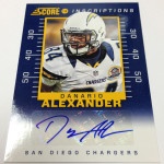
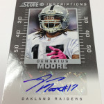
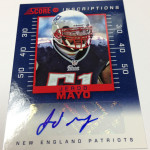
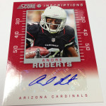
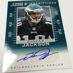
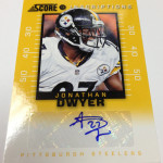
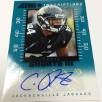
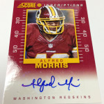
Those cards pictured look like the player is on a thermometer that has a sticker on it.