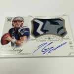
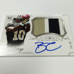
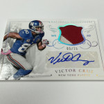
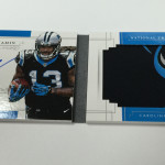
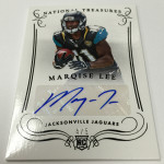
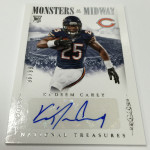
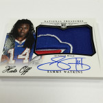
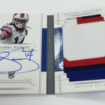
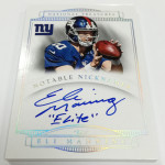
Big Week Ahead – Releases of 2014 National Treasures and 2014 Five Star

This is one of the biggest weeks in the hobby coming up, with two of the biggest products of the year coming out this coming Wednesday. These two products have become the biggest releases for the high end space, with each having some massive hits in the course of the breaks.

Five Star

I love the look of the product this year, with the first time that baseball and football have had the same look. Baseball had some really nice looking cards, and I cannot wait to see what Five Star has in order. Last year's product looked similarly great despite a horrible RC class, and continues the long standing tradition of Five Star being the best looking product in the tier.

It does not come without disappointment this year, as the non-rookie checklist does not look like it matches what it has been in the last few years. This comes as a bit of a surprise considering how star studded the on card checklist was for Museum Collection. Not only that, but my favorite cards of the year, are no longer part of the checklist. Previously, the inscription cards have always been the gem, but they have been seemingly left off the checklist for 2014. This is borderline blasphemy for me, and I cannot express how disappointed I am that none of them are part of the set.

Check out what I mean:

2014 Five Star Bo Jackson Auto Inscription Quotables

2010 Five Star Adrian Peterosn Auto Inscription Quotables

2012 Five Star Andrew Luck Auto Inscription Quotables

2011 Five Star Peyton Manning Auto Inscription Quotables

Overall, I think that this product will still be on par, and the rookie content will still make the product worth checking out. This year’s single logo autographs are the first time that Five Star has offered cards like this (usually dual logos), and I am quite interested to see how they perform. Because Topps does not offer many logo cards over the course of the year, hopefully they will be special, unlike Panini who puts out 10 per rookie per product.

National Treasures

Over the last two years, I think the design for Treasures has been better than it has been in the previous years combined. I have often said that it does not deserve the fanfare it has relished over its run, as the cards have been so ugly to describe with normal adjectives most years.

One of the biggest factors that I see making treasures such a disaster each year is that it uses sticker autographs in a product that costs as much as NT does. Additionally, this year they are using stickers for the rookies more than I have seen in previous years, which makes me question why an ultra high end product cant have 100% hard signed rookie content, but other products from Panini can? That makes no sense. Maybe Panini should spend less time putting together horse shit products like Spectra and Black Gold and focus on delivering for their biggest release of the year.

That being said about the stickers, I am a huge fan of the rookie auto patch design and a bigger fan of the cards that are on card. This year’s design is EASILY the best design treasures has ever had, and its sad that wax breakers will have to endure the sticker embarrassment just to get at the good stuff. Similar things could be said about the shitty throwaway relics that have plagued this product for so many years. Dear Panini, THE JUNK RELIC IS DEAD. Let it rest in peace, instead of annually digging it out of the shallow grave you are responsible for putting it in.

Despite collecting the hell out of Teddy Bridgewater all year, this is likely the first year I will not be buying any boxes of either product. I will be picking up singles from both, but I just cant see spending a ton on this year’s stuff – especially when we havent seen any previews that showcase a reason to buy either set.

SCU Go Live Report: 2014 Black Gold Football

I remember back when Panini first started previewing Black Gold, and how impressed I was with the cards that were similar to the Clear Cuts from Strata. Now that the product is live, I see why they led with those cards. So much of the product looks absolutely terrible, that I am shocked at how awful it turned out. I understand why people would like the cards, but I see it in a situation that is very similar to Topps Triple Threads. As we continue to see, people dont care enough about design, and only care about things related to patch content.

Sizable Signatures

I absolutely love these cards, at least the ones that are on card. Although the sticker versions arent even close to as cool, the overall concept is the best of the product. As I have said before, if you are going to rip off a concept, do it as good or better than the original. Compared to the Strata Clear Cuts, which look to be the inspiration here, they did that and then some. There are a ton of parallels, but the rarer ones definitely are pretty cool in just about every way.

2014 Black Gold Mike Evans Nike Swoosh Sizeable Signatures

2014 Black Gold Teddy Bridgewater Sizeable Signatures Auto Relic

2014 Black Gold Kelvin Benjamin Sizeable Signatures Auto Relic

Verdict: WINNER

Veteran Patch Autos

Like we saw with sizeable sigantures, the on card content in this set looks really good. I like that they signed over the swatches on acetate, as it gives the appearance of a signed swatch without the mess of an actual signed swatch. This is copied directly from a few sets that Upper Deck has done in the past, but they are clearly on par.

2014 Black Gold Demarco Murray Signed Patch Acetate

2014 Black Gold Ladanian Tomlinson Signed Patch Acetate

2014 Black Gold Terrell Davis Signed Patch Acetate

Verdict: WINNER

Triple Relics and Dual Relics

It is obvious that Panini spent a ton of extra money on technology for this product, but it only worked out in about 30% of the print run. These cards look really nice, and actually have a pretty interesting layout that works very well. Unlike some of the other relics, I like the design. The use of the dual layer presentation really works well in many cases, and I think that if Panini had been able to correlate this to the terrible parts of the set, I wouldnt be as disgusted with Black Gold.

2014 Black Gold Sammy Watkins Triple Relic Mother Lode

2014 Black Gold Dez Bryant Dual Relic

2014 Black Gold Derek Carr Triple Relic Mother Lode

Verdict WINNER

Hood Ornament Team Logos

I hate these cards. I hate just about everything about them. Dont get me wrong, the concept isnt bad. Manu-relics are proving to be a viable replacement for single relic cards that sell for nothing. However, the way Panini did these are fucking horrendous. First off, the logos are too small, so it leaves a TON of empty space on the card. Its even worse on the vertical versions, where Panini inexplicably chose to cram the player on the top of the giant window.

2014 Black Gold Richard Sherman Hood Ornament Logo

2014 Black Gold Andrew Luck Hood Ornament Logo

2014 Black Gold Aaron Rodgers / Davante Adams Dual Packers Hood Ornament

Verdict: LOSER!!

Rookie and Veteran Acetate Sticker Autos

There are a bunch of different versions of the stickers on acetate, and each one is worse looking than the one before it. For the reasons we see here, companies rarely design products with dark backgrounds unless they are going to be hard signed. Panini thought they could sneak one past the design goalie by creating windows of dual layer acetate to house the sticker auto. Boy did they mess this up. 2014 Black Gold Odell Beckham Jr Base Its more reminiscent of the infamous 2008 Topps Lettermen train wreck than cards worth anyone's time Card. But as we are seeing, the sheep will buy anything.

2014 Black Gold JJ Watt Acetate Sticker Auto

2014 Black Gold Derek Carr Acetate Sticker Auto Patch

Verdict: LOSER

Rookie and Veteran Paper Autos

I didnt understand these cards when Panini did them in Immaculate, and I DEFINITELY dont understand them now. These are printed to be hard signed, not signed paper inserted like a cut autograph after the fact. Why? Someone needs to explain to me why Panini thinks this looks good? It is so visually disastrous that I dont even know what to say. If it werent for the quad relics, these would be the worst cards in the set, but they are definitely the worst of the autographs. Panini should be ashamed of themselves. These cards are hot garbage.

2014 Black Gold Jeremy Hill Paper Auto RC

Verdict: BIG LOSER!

Rookie Jumbo Patch Sticker Autos

Every part of these cards are inferior to the sizeable signatures. Sticker autos instead of on card. Rookie photo shoot player pics instead of game shots. Terrible design instead of a good design. To start, its now March, there is no reason you need to continue to use photo shoot pics. Game shots are readily available. Secondly, these stickers were definitely signed just for these cards, so why not just get them hard signed? Lastly, the vertical orientation, with the player crammed at the top looks fucking horrid. Jumbo patches NEVER work with vertical cards. Stop trying to make it work, its not going to work Panini.

2014 Black Gold Teddy Bridgewater Vikings Head Logo Sticker Auto Patch

2014 Black Gold Johnny Manziel Jumbo Patch Sticker Auto

Verdict: LOSER

Rookie Quad Relics

Not only did Panini AGAIN try to use the vertical presentation, but they used some of the GOOFIEST fucking pictures I have ever seen. Seriously, look at the pics of the players. Its almost like Panini thought they could sneak them through because everyone would be looking at the relics. I cant stand that. These are easily some of the worst cards in the product, and that is saying a lot. When your picture choice inspires a caption contest, something went horribly wrong.

2014 Black Gold Johnny Manziel Quad Relic

2014 Black Gold Blake Bortles Quad Relic

2014 Black Gold Teddy Bridgewater Quad Relic

Verdict: BIGGEST LOSER

Base Cards

I really like the base card design. However, this is a high end product, and base cards really dont matter all that much. The dual layer approach works really well.

2014 Black Gold Odell Beckham Jr Base Card

Verdict: WINNER

Overall Black Gold had so much potential to be one of the better products of the year. Instead it turned out to be more dud than anything, and Panini’s stupid decision making is to blame for that. Half of the cards in the set would be a million times better if they actually knew what good design work consisted of, but as always, they prove they know nothing. Too bad, because all those thousands of extra dollars put into the technology are wasted.

With a great looking Five Star set released next week, and National Treasures the first week in April, no one should waste their fucking time with this horse shit. Both Treasures and Five Star will be FAAAAAR superior singles set, and these cards will drop like the dense poop they are. Im still in shock that Panini will be the only choice for licensed NFL cards in 2016. That should scare the crap out of everyone.