If you guys have been following along with my site, you will likely know my affinity for the ever growing community of Topps Digital apps. The biggest of the 4 games is Topps Bunt, which combines fantasy baseball with card collecting in a digital arena. The game is an absolute blast, and yesterday, they released their build for the upcoming 2015 season.
As expected, there is already a pretty active secondary market for the cards:
2015 Topps Bunt Clayton Kershaw Super Rare Gold Base Card
2015 Topps Bunt Mike Trout Team Spirit Insert Card
2015 Topps Bunt Rusney Castillo Gold Base Card RC
2015 Topps Bunt Adrian Beltre T206 Mini Insert
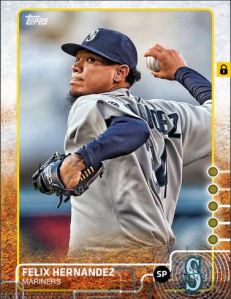
As you can see, the cards mirror the 2015 Topps series one cards, including the look and feel, but digital has made a niche for themselves by creating some pretty stunning exclusive insert cards only available on their apps. If you havent checked it out yet, this is definitely the time to do it.
For my other site, digitalcardcentral.com, I wrote a pretty extensive breakdown, and I think its worth sharing here, just in case a few people want to read up. I would also check out this article for more information, as well. If you want to see more articles I have done on this site regarding the world of digital, its all here in this search.
We are less than a day into the new season of Bunt, but I have already spent a number of hours tooling around in the app to see what has changed and what has stayed the same. Let me start off by saying things are different but similar. I know that there are a lot of people who will say that because its different, its terrible, but I urge you to give it a shot. Here is a breakdown.
Home Screen
There are some nice changes to the home screen that I like, and some that I absolutely hate. As for the good, I think that putting the bulletin box in the top left corner will work well so that everyone can see immediately if they have a message. Additionally, moving the games on tap down near the bottom is nice, as not many people use that box anyways.
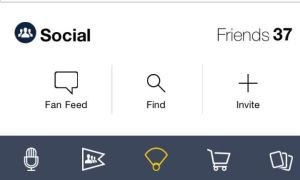
Here is where one of my biggest gripes of the new layout exists, and it is going to greatly impact the way I interact with the game. Instead of the flag icon at the bottom representing the fan feed, it is representing the contests screen. The fan feed has been moved to the bottom of the home screen under social, which normally would be a good thing. It causes one specific ripple effect, which I absolutely hate – you can no longer toggle between the fan feed and the trade screen with single clicks. You have to back out of the feed to access trades, which will be very annoying. It seems like a little thing, but for someone like me that loves to go back and forth, its going to take some getting used to.
Now, as the contests become more a part of the every day usage of the app, this could change. I have a feeling the layout was deliberate in that fact at the moment, but until the contests get going, this is the way I am going to feel.
Store Screen
If you havent been playing along with Star Wars Card Trader, this new type of structure is going to be very foreign to people. Its also going to cause a few unhappy people who have transferred from last year, as the card availability is one of the bigger changes.
Here is the way it works. When you open the store, you will see 3 packs at the moment. These packs are the 1, 3, and 5 card pack. The first pack only contains commons and uncommons, the second contains the first two levels, plus a 1% shot at rare, and the third contains the first two levels with a higher percent shot at rare. Last year, all packs contained all cards, which made it easier to buy cheaper packs and get the top cards.
To get access to the Scarce Blue cards and the Super Rare Gold cards, you need to buy a bundle of coins with real money from the store. It can be the .99 cent bundle, but you will need to buy to see the best packs. The new packs will be a 5 card pack with a 5% shot at blue, and a 15 card pack with a 1% shot at Gold SR.
This is the way it is in Star Wars as well, and to be honest, it wont be as bad as you think it will. From what happened in the other game, the inserts were available to everyone regardless of purchase status. They usually got their own pack, and no one missed out on those cards. Once the inserts are live, they will become the more valuable cards, and golds will be more readily accessible. As the season goes on, the golds will not sell out and more people will be apt to trade them.
Free players and even some of the lower tier pay players will be upset that they are not going to have the same kind of access they did last year, but that shouldnt come as a surprise. If you dont pay to play, your existence in the game is less important than those that do. I understand that last year was different, but I get this change.
There are also significant changes to the play structure that should lend itself more to ensuring a more equal playing field in the gameplay element, so its a bit of a tradeoff. Bottom line, free players are tolerated, but not catered to, and that shouldnt be a shock to an app that needs to make money.
The positive thing with this is that Golds will be significantly more valuable, and add more of a chase to the game. That is a very good thing, as it was so easy to pick up cards at will. The new structure puts more of a focus on collecting specific targets and really building a team instead of just getting 9 of everything and letting the chips fall as they may. As we will see in the contest screen portion of this post, more of a focus on the fantasy element is a common thread for 2015.
Go check out the situation over on Star Wars, where 10,000 count inserts sell out in a matter of hours. The structure has reshaped the value proposition, and I think if you give it a chance, you will see what I mean.
Contest Screen
This is the biggest change of anything, and I also see it as one of the best improvements for the year. As I explained in my first post about the 2015 structure, users are no longer going to compete against the entire leaderboard every day of every week. Instead, you will be able to sign up for special “contest leagues” that can last from a day to a week, to possibly longer.
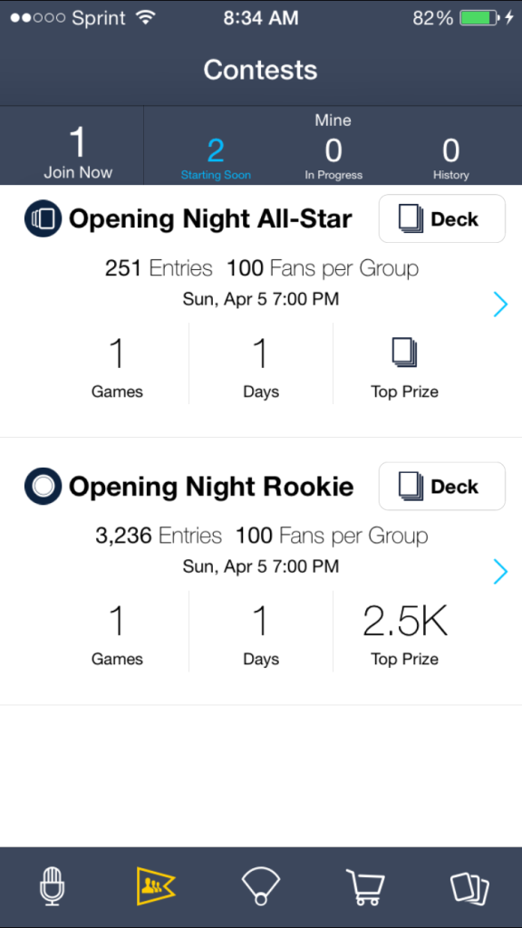
Right now, there are 3 options. The first option is the free league, that can be entered without paying any coin fee. The prizes are listed on the screen, where the top person will win 2500 coins. You can only play Cubs and Cardinals, as it is a one day league, and that is the only game on the schedule. The boost is limited to 175, which means that all your cards can only add up to 175x. At this stage, that is astronomical, but in the future, it may more of a limiting factor. You can basically play a max of 175 cards in this league, as each common is 1x. Each boost above the 1x will take more of the pie, and will limit the amount of cards you can play.
Above the free league will be the All Star League for 7500 coins and a middle league too. Each has different prizes, which includes a 20k pack sent to the winner of the All Star League. These two leagues are not different in play structure, its just about the level of competition.
You might say that the big pay users will just join every league and win, but that is where things get a bit different. You cant use the same cards for each league. Once a card is used in a play deck for a certain contest league, its not available for the others. More of an even playing field for right now.
In the future, there is no guarantee that the Diamond VIP users wont eventually collect enough cards to have enough to use in all available contest leagues, but for right now, I doubt it will be a factor.
There are also a number of league ideas that wont make it so simple as 175x and one game. This contest screen provides a significant opportunity to have a lot of fun with the structure week to week.
Card Sheet Screen
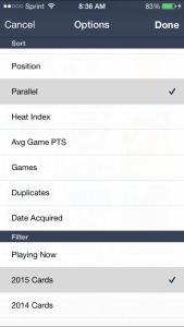
Before I start, Topps has already said in the comments that sort filters will be fixed in a future update. Until that happens, this is going to be a relative mess. The best way to organize cards is by parallel, and that does not give any indication of rarity inside the different parallels available.
Because sort by rarity is unavailable, everything is sorted alphabetically. For 2015, there are not that many cards and its still relatively easy to follow. But for 2014 and before, the cards are no longer able to be displayed in a way that is easy to follow in any way. Alphabetically just doesnt work, and with every pre-2015 card in the same “Not For Sale” parallel, its impossible to find anything just by looking through someone’s sheet.
Once sorting by rarity is available, this will all be an easy fix, and I dont think its going to be a big deal to wait AT THIS POINT IN THE GAME.


