Legacy is a strong word in the hobby, and Contenders is definitely one of the products that has managed to secure a pretty strong one. However, Im not sure its been the most deserving of said legacy, with many years of the product’s concept and design being very below what we have seen from other sets released. This includes the ones released by Panini themselves. Its puzzling for me in that respect, how so much of Contenders is about what is in the set, not what is ON THE CARDS
.
Here are some of the worst of the worst Contenders designs, and this is only a handful:
2003 Contenders Tony Romo Auto Ticket BGS 9.5 – Giant foil stickers with huge text “Rookie” 5 times on the card, Yay!
2008 Contenders Joe Flacco Auto Ticket BGS 9.5 – Only Panini knows why the word “Rookie” needed to be displayed in huge text over the player.
2009 Contenders Matthew Stafford Auto Ticket – Text keeps getting bigger for some reason. At least on card, but who cares at this point?
2011 Contenders DeMarco Murray Rookie Ticket Auto – This is honestly the worst Contenders design of the run. Horrible presentation.
There are some good ones, but not enough to redeem our infatuation:
2010 Contenders Dez Bryant Auto Ticket BGS 9.5 – Even though it was almost ruined by the stupid foilboard, the design itself is awesome.
1998 Contenders Randy Moss Rookie Ticket Auto – this one is the best of all time, hands down.
2013 Contenders Eddie Lacy Rookie Ticket Auto – Terrible class, but much better design
One of the main reasons that I have loved Chrome as much as I have is because it rarely disappoints in the way of how the cards look. With the exception of a few years, the product has exceeded the legacy even that set has cultivated within the hobby. Even in a year like 2014, when the product is so overproduced that no one can pull anything out of any box, it is still delivers highly coveted cards
.
With Contenders, it seems to accomplish some of what Chrome does DESPITE design work that I find to be even the slightest bit visually appealing. Funnier still, the year of the product that everyone points to as the best in recent memory is actually a retro design from 1998. The cards that Panini was responsible for turned out to be just as horrendous as many of the other years they put together
.
You would expect that a product, responsible for some of the worst looking cards of the modern era, would never be able to stand the test of time. Instead it remains one of Panini’s best selling sets. That is what I dont get. If a product never seems to measure up in the design department, and the cards arent up to par in many ways, why is it so popular on a continual basis?
One cannot deny that the Peyton Manning Rookie Ticket and the Tom Brady Rookie Ticket
represent two of the more iconic modern football cards in existence. Brady even more represents Contenders’ approach as a late round pick getting love on an expansive checklist. That being said, I have yet to see any card outside of those two that really looks all that great, as long as you include Luck as an extension of the 1998 layout from the iconic Manning
.
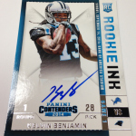
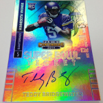
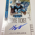
This year’s set, as previewed again today, is very much in the same vein as many of the other Contenders sets of years past. Horribly ugly rainbow and regular foil stock, terrible design work with huge text and separated areas for the signature, and a clear representation that Contenders does not represent the best of the best Panini products.
As I mentioned in a post when the preview was first released, the design for the Rookie Ink set is FAAAAAAAAR superior to the ticket design for 2014, even to the point where Im curious if someone messed up. The Rookie Ink IS ACTUALLY demonstrative of the ticket motif used in previous sets, right down to the faux perforation at the bottom of the “ticket” area. I dont get it one single bit.
Most importantly of all of this consideration is that this will be the only game in town come 2016. Because it is abundantly clear that the NFL cares more about the money that Panini can provide, I would guess this stuff will continue to not make one bit of difference to anyone in a decision making position. I have gotten multiple reports that Panini does not foster an environment that would allow for collector feedback to be incorporated into the set design, so I DO NOT expect this style to change. Panini has their way of doing things, so get on the train or watch it leave. That means the unsustainable nature of the sports card business in football will continue to spiral out of control. Not just because of poor skills of Panini’s design team, but because they have shown time and time again that they are unable and unwilling to adapt.
Collectors will continue to buy Contenders in the shadow of Manning and Brady, but may never again get to experience a great looking card that we deserve.


